ivoryjones Posted April 5, 2013 Author Report Share Posted April 5, 2013 (edited) Philippe, in the '80s here in Brazil Miami Vice was broadcast in Portuguese, and the prints varied a lot in quality. Seasons 1 and 2 looked like crap! Then things got better from season 3 on.The cable run that just started on TCM is a kind of "regional" project and encompasses Latin America Countries. I believe that in all those countries the broadcasts will be on the same sources (even the promos are the same!), except for the audio (here in Brazil it's going dual audio, original English and the '80s Portuguese dubbing).In this situation, I think good copies were sent to TCM Latin America, and I believe they're relatively new masters, as in most parts they look like the DVDs (but with the Universal Logo that is absent in the DVDs, and other minor differences like the lost "Santa Claus" line on "Heart of Darkness" DVD). In some episodes there are obvious differences. For instance, the pilot aired last Monday, and it was the "Brother's Keeper" credits version (which I've never seen before!). The pilot looked really great and was way different than the DVD. The colors were a lot colder than the DVD, which in general looks way too "warm" to me (notice it's rare to see a white glow on the DVDs that doesn't has certain pinkish shading). Nevertheless, the fact that the pilot here looked different doesn't mean it was closer to the original look (unfortunately, I've never seen the first airings of the pilot!)Tekka has mentioned the possibility that the openings were shot in 16mm, not in 35mm. That made me think something else, about the end of Freefall, as Kavinsky has noticed how the end clip of Freefall even on DVD looked a bit like in the old days. I rewatched it again, and it seems that something completely changes when that end clip starts, a little after Crockett and Tubbs shake hands. I have the feeling that the master of that end clip was a videotape, not print!!! Maybe the footage from previous eps was previously converted to video to make the videoclip editing easier/faster to the production team, so the end of Freefall could have been made out of it! That would explain why the end clip could keep a certain '80s look and it feels different than the rest of the episode on DVD. But it's just a thought!The '80s look to me has to do with two things: prints in good shape and '80s telecine process (= conversion from print to master videotape). Prints change in color with time, they get reddish, lose blues and blacks get weak, but back in the '80s they were new! And the telecine process of the '80s must have been based on different standards, so I think the differences are more about those details than a VHS fault. I've seen the pilot and "The Prodigal Son" on laserdisc and they also had a kind of "super white" and strong contrast that the VHSs do. And laserdisc was a fantastic format.I particularly like the way Miami Vice looked in old media, but I can understand who doesn't. Many minds many sentences: to my eyes, the DVDs look beautifully sharp, but boring dim and reddish... The way Duty and Honor looks on DVD is pretty awful to me. To me is the worst case, and that's an episode I can find no way to make it look slightly as I once knew it. DVD. Notice it's not a white shirt anymore, as every white has a kind of warm "sunset effect"/"pink effect" on (that's what print aging does!); even the white on Castillo's eyes look reddish. Check it out: A restored VHS tape. There's no color bleeding anywhere, and those strong colors and darker look were there during broadcast, only less saturated and with sharper detail. But VHS does keep the overall feeling and most of the details! Here's the restored tape: DVD. I simply can't stand this, and I've never seen this pattern in the '80s: vinegar sea (!!!!), a dim white glow warmed by print aging: VHS. Strong white glow, a blue sea that was not at all uncommon on old broadcasts, though here in particular it was stronger than usual. To me, it's still a prove that that general pattern was (with some variation from episode to episode) the "right" one as the "Miami Vice II" album shows it on the cover (it was released during 3rd season)! DVD. The "sunset effect" on a night scene, awful to me. It looks like a '70s cop show (on an decades later rerun!): VHS. Yes!!! Rich blues, complete absent on the aged print unrestored used on the DVDs! It's not the VHS tape that "created" this, it was on the broadcast! Here's the VHS: DVD. Again the "sunset effect", again Castillo's once white shirt is not that white anymore, and now he's badly sunburnt! Not to mention that a house with no lights is too lit: VHS. YEAH!!!!!!! A print that still had strong blue colors, long before they fade! This scene is just fantastic that way, especially with Jan Hammer cue and its strong piano lines!! Check the VHS out: DVD. Even the letters of the name Michael Mann are not perfectly white: VHS: Edited December 29, 2016 by ivoryjones spacing got all wrong Quote Link to comment Share on other sites More sharing options...
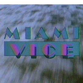
ViceFanMan Posted April 6, 2013 Report Share Posted April 6, 2013 My main frustration about the DVD (and there are others!) is what I believe to be a complete wrong showing of the 3-5 seasons logo. At least here in my Country original broadcasts' date=' the 3-5 seasons logo never ever looked like it does nowadays on DVD. I was completely addicted to the darker blueish teal "Miami" with the pink "Vice" and the blinding white glow (not unlike the cover logo of the album "Miami Vice II"). On DVD, it became a kind of aqua/purple with a dimmed white-pinkish glow. That still gives me a good amount of frustration (really!).ViceManFan, in my Country, TCM channel has just started a run on Miami Vice. For the first time ever, I could see the first 3 episodes opening titles restored. Even in the '80s, at least here, there was a lot of grain and scratches especially on the "Rodriguez eps" openings. Somehow they're completely gone on this cable run. So people at cable are doing a better job than Universal as far as the opening is concerned. They also kept the Universal logo at the ends and the famous "Santa Claus" line from "Heart of Darkness", absent on DVD. The bad side is that there's a lot of compression, so here and there one can see the digital "artifacts" around...But funny is that the "restored" opening seemed to be zoomed in. The logo and the actors names are a lot bigger now...[/quote']Yeah, to be honest I saw more of the first two seasons (some of 3) of "MV" during its original run in the 80's. I think the DVD's, for the most part, have those season's logos correct. However, as you said the restoration job for the openings did not happen. As for some of season 3 and on through 5...I didn't see all of those episodes during the original run. Some of those episodes I didn't see for the first time until the DVD's were released. So, to be honest I'm not sure what the original logo was like for seasons 4 & 5...don't remember? :confused: I'm not sure why they did mess with the logos and colors for the DVD's? However, I do have 3 or so episodes from season 5 on tape that are original NBC airings! It's been several years since I've watched those. I might have to get them out and remind myself what the logo for season 5 truly looked like.As for the openings in the cable rerun airings looking better than the DVD's openings...that actually has happened here too. I'm not sure about your TCM channel (that's Turner Classic Movies--from the 30's-60's here) but from 2005-2007 the cable network TV Land aired "MV" reruns. Their copies had definitely been digitally restored and even the openings looked pretty good...even better than the DVD's! I have most of TV Land's airings on tape Older rerun airings on other cable networks: USA network (early 90's) and fx (mid-late 90's) had not been restored yet and you could tell.As for your network zooming in closer on scenes and names, and changing the opening that way...don't know? I don't remember seeing that here at all. I don't think I'd like that. Universal needed to restore all the openings and include the original colors. That's the way I want to see them! But, despite the "opening issue" I have with the DVD's...the actual episode content I have no problem with. I think the episodes have been restored "superbly" and really showcase the original color scheme of the series! I'm still very thankful for the DVD sets, also with all the original music, and always enjoy going through them! Quote Link to comment Share on other sites More sharing options...
ivoryjones Posted April 6, 2013 Author Report Share Posted April 6, 2013 ViceFanMan, for the very few scenes I've seen from NBC original run and for the more scenes I've seen from USA cable channel, they seemed to be a little bit close to each other, though not exactly the same. Do you have any memory on that? Quote Link to comment Share on other sites More sharing options...
Vincent Hanna Posted April 6, 2013 Report Share Posted April 6, 2013 DVD. The "sunset effect" on a night scene" data-date=" awful to me. It looks like a ">http://i5.photobucket.com/albums/y172/eddiequist/mv/dutyandhonor03_zpsbccbef3b.jpgVHS. Yes!!! Rich blues, complete absent on the aged print unrestored used on the DVDs! It's not the VHS tape that "created" this, it was on the broadcast!DVD. Again the "sunset effect", again Castillo's once white shirt is not that white anymore, and now he's badly sunburnt! Not to mention that a house with no lights is too lit.VHS. YEAH!!!!!!! A print that still had strong blue colors, long before they fade! This scene is just fantastic that way, especially with Jan Hammer cue and its strong piano lines!!VHS.Wow thats incredible. Very Manhunter style. I have no idea how the colours are like opposites on the dvd, i didnt know film aging does that. I really wish we had some blu rays with the correct colours now. Quote Link to comment Share on other sites More sharing options...
ivoryjones Posted April 6, 2013 Author Report Share Posted April 6, 2013 I never thought about the Manhunter relation!!!! Now that you mentioned it, it just became very clear! Quote Link to comment Share on other sites More sharing options...
ViceFanMan Posted April 6, 2013 Report Share Posted April 6, 2013 ViceFanMan' date=' for the very few scenes I've seen from NBC original run and for the more scenes I've seen from USA cable channel, they seemed to be a little bit close to each other, though not exactly the same. Do you have any memory on that?[/quote']I don't know about the USA airings and the original NBC airings looking more like each other than other reruns...but most likely! "Miami Vice" went off the air in 1989. The very next year, 1990, USA began airing reurns. I think they were the first cable network to do so. They were also the first network to air the "lost" episode "Too Much Too Late"--which had not been aired by NBC originally because of material considered too "dark" for the time. So, most likely their airings were the NBC ones...just with more editing to make room for USA's commercials.I just got out some of my "MV" VHS tapes...took me over half an hour to get to them, but I did it. I watched a beginning from a fourth season episode ("Hell Hath No Fury"--TV Land airing). Although, it's a very good copy with the colors and restoration job (including from what I could tell most of the opening too) it did have the possibly incorrect green & violet logo.I then got out my few original NBC airing tapes. They are awesome to me because some include original commercials, as well as the original "Miami Vice Will Be Right Back" ads in the middle of the episode. But, they are very old and the picture is somewhat out of focus & "grainy", colors faded in some places, and it's not like watching the DVD sets.However, these original NBC airings I have from season 5 do prove that the DVD sets are wrong with their logos during the openings. Originally it was the teal and pink, with the white glow around it. On the DVD set they have the green & violet thing. I have no idea why they did that? It makes no sense! Also, as you've stated before, the water is a strange "gray" color on the DVD's ...while in the older reruns it's still more of a dark blue color--as was originally aired.But, as for the episode content on the DVD sets...again in my opinion the DVD sets are way better than any of the previous airings (minus the openings with the logo). Using those pics of Castillo in the previous posts before this...the dark blue was okay, but it also made it very hard to discern who was who and/or what was going on. It was almost too dark. With the DVD's you can see what is going on and very clearly. Quote Link to comment Share on other sites More sharing options...
ivoryjones Posted April 6, 2013 Author Report Share Posted April 6, 2013 do prove that the DVD sets are wrong with their logos during the openings. Originally it was the teal and pink, with the white glow around it. On the DVD set they have the green & violet thing. I have no idea why they did that? It makes no sense! Also, as you've stated before, the water is a strange "gray" color on the DVD's ...while in the older reruns it's still more of a dark blue color--as was originally aired.But, as for the episode content on the DVD sets...again in my opinion the DVD sets are way better than any of the previous airings (minus the openings with the logo). Using those pics of Castillo in the previous posts before this...the dark blue was okay, but it also made it very hard to discern who was who and/or what was going on. It was almost too dark. With the DVD's you can see what is going on and very clearly. I can't thank you enough for the great info you post here! It's very nice to have a confirmation like this one you gave us all regarding the original airings and the teal/pink/blue sea pattern appearing on it!I understand clearly your point regarding the episodes scenes themselves on the original old sources (aside the opening titles). I had to be crazy to say that the DVDs have nothing to offer in terms of discerning details and even in terms of color! Maybe it's a bit like the discussion regarding vinyl X CD, in which some people say details were lost on the CDs but then again one must see that also were (thankfully) lost all the clicking/pops/rumble/scratches of the vinyl!My main frustration comes from this: I expected that the DVDs could have all the good sides you mention (which I'd call, in lack of a better word, a "visual excelence") but also keep a good connection with the old look (but getting rid of the limitations of older technologies)! I suppose that could be possible and would not hurt at all! For instance, if that Castillo blue scenes on Duty and Honor at least kept their "blue mood" but were lighter, clearer, more in focus, that would be the best of all worlds... I can imagine that scene being still blue but having the DVD "good part" also on it (the details would be in sight, focus would be perfect). That was more or less what I was expecting before the releases, but it didn't happen.So know I think of someting. Maybe the budget of the DVD releases has something to do with its visual problems? I suppose the budget was very tight because of the huge payment on music copyrights. Many of us will remember the immense anxiety fans have been through when there were rumours that the MV pop music would be replaced by generic soundtrack (as it happened with "Wiseguy"). Maybe because Universal put all those bucks paying music royalties, it would not care that a lot to guarantee the best visual experience and a proper restoration... Quote Link to comment Share on other sites More sharing options...
ViceFanMan Posted April 6, 2013 Report Share Posted April 6, 2013 I can't thank you enough for the great info you post here! It's very nice to have a confirmation like this one you gave us all regarding the original airings and the teal/pink/blue sea pattern appearing on it!I understand clearly your point regarding the episodes scenes themselves on the original old sources (aside the opening titles). I had to be crazy to say that the DVDs have nothing to offer in terms of discerning details and even in terms of color! Maybe it's a bit like the discussion regarding vinyl X CD' date=' in which some people say details were lost on the CDs but then again one must see that also were (thankfully) lost all the clicking/pops/rumble/scratches of the vinyl!My main frustration comes from this: I expected that the DVDs could have all the good sides you mention (which I'd call, in lack of a better word, a "visual excelence") but also keep a good connection with the old look (but getting rid of the limitations of older technologies)! I suppose that could be possible and would not hurt at all! For instance, if that Castillo blue scenes on Duty and Honor at least kept their "blue mood" but were lighter, clearer, more in focus, that would be the best of all worlds... I can imagine that scene being still blue but having the DVD "good part" also on it (the details would be in sight, focus would be perfect). That was more or less what I was expecting before the releases, but it didn't happen.So know I think of someting. Maybe the budget of the DVD releases has something to do with its visual problems? I suppose the budget was very tight because of the huge payment on music copyrights. Many of us will remember the immense anxiety fans have been through when there were rumours that the MV pop music would be replaced by generic soundtrack (as it happened with "Wiseguy"). Maybe because Universal put all those bucks paying music royalties, it would not care that a lot to guarantee the best visual experience and a proper restoration...[/quote']No problem! It's always fun to compare things and see how they hold up, so-to-speak. Yeah, the blue scenes with Castillo in "Duty and Honor" could maybe have been left in with the DVD's but maybe "cleaned" up some. But, maybe the original copies were too damaged or faded, and they had to do something else. So, rather than add some kind of strange blue lighting in again...they went with something more realistic? I don't know...it is interesting to see the differences. By the way...I was somewhat mistaken before, as I have a few original NBC airing episodes from season 3, 4 and 5...not just season 5! Not in any kind of order, the original airings I have are: "Down For the Count" Pts 1&2, "Baseballs of Death", "To Have and To Hold", "Miami Squeeze", "Miracle Man", "Over the Line", Jack of all Trades", and "The Cell Within". I looked at the beginnings of "Baseballs of Death" from season 4 and "Miracle Man" from season 5. Both had the teal and pink, with white glow, as the logo. Neither had any green and violet thing.However, I also looked at a couple of my old fx reruns...and they did have the green and violet logo! FX (or originally went by lower-case letters: fx) aired reruns in the mid-late 90's (maybe 1996-1999?). I think USA was first, TNN aired reruns at some point too, then fx, and then TV Land. Some network called Sleuth also aired reruns around the same time TV Land did...but Sleuth was only available in certain cities in the U.S. I have never gotten that network. But, I wonder when the logo change was made...from the original teal and pink, to the green and violet? So, this proves that Universal and the DVD sets did not make this change! It had to have happened, for whatever reason, by another network--and obviously before other digital restorations (such as by TV Land) were made in later reruns--as the fx reruns had not been digitally restored yet, like TV Land's were. I thought I had a couple old USA airings...but I can only find TV Land and fx ones. It would be interesting to compare a USA rerun to an fx one, to see if the logo change was made by one of those networks. I have not seen a TNN rerun...but it also could have been them that for whatever reason changed the logo for seasons 4 and 5? Yeah, I would have preferred the DVD sets be totally restored exactly like the original airings...but for whatever reasons maybe that just wasn't possible?? Whatever the case, I still love my DVD sets and use them when going through the show. However, I will watch my few episodes on my original NBC airing VHS tapes first...then watch the DVD's to compare. Quote Link to comment Share on other sites More sharing options...
ivoryjones Posted April 6, 2013 Author Report Share Posted April 6, 2013 Very nice info, thanks again ViceFanMan!It's interesting that you mention that apparently the first time the logo appeared messed up was in the mid-late '90s!!!That's truly relevant as indeed about the same time Columbia House released 10 tapes of Miami Vice on home video (I believe it was on 1997), and those tapes already showed seasons 3-4 with changes in the logo color...I can think only of two things: either, as you mentioned, most probably a network/company changed things somehow and then the others followed/re-used the latest "job" or, maybe less probable, one might also suggest that by the mid '90s the prints were already in such a bad shape so everyone that used them got into the green/violet/red sea logo the same...One thing that I once read/heard and can't remember the source nor verify whether it's true or not is that productions from the '80s are still in a "bad age" in terms of restoration "agenda". That's supposedly because they're too "young" to make a full and careful restoration obligatory (as for instance a movie as old as "2001" would need) but too "old" to look good wihout some sort of hard work on it. It makes sense to me, but who knows! Quote Link to comment Share on other sites More sharing options...
Matt5 Posted April 6, 2013 Report Share Posted April 6, 2013 Amazing variation - not always for the best Quote Link to comment Share on other sites More sharing options...
ViceFanMan Posted April 7, 2013 Report Share Posted April 7, 2013 Amazing variation - not always for the best Yup. The "changed" logos aren't necessarily that bad...they just aren't original. Very nice info' date=' thanks again ViceFanMan!It's interesting that you mention that apparently the first time the logo appeared messed up was in the mid-late '90s!!!That's truly relevant as indeed about the same time Columbia House released 10 tapes of Miami Vice on home video (I believe it was on 1997)' date=' and those tapes already showed seasons 3-4 with changes in the logo color...I can think only of two things: either, as you mentioned, most probably a network/company changed things somehow and then the others followed/re-used the latest "job" or, maybe less probable, one might also suggest that by the mid '90s the prints were already in such a bad shape so everyone that used them got into the green/violet/red sea logo the same...One thing that I once read/heard and can't remember the source nor verify whether it's true or not is that productions from the '80s are still in a "bad age" in terms of restoration "agenda". That's supposedly because they're too "young" to make a full and careful restoration obligatory (as for instance a movie as old as "2001" would need) but too "old" to look good wihout some sort of hard work on it. It makes sense to me, but who knows![/quote'']No problem! It's been fun to compare all these things, and to see around the time the logo-change was made. :thumbsup:It's probably true...that things from the 80's usually aren't considered "old" or classic enough yet to be up for a good restoration job. So, when other networks in the 90's acquired the show for reruns, they might of had to change some of the logo colors because the original prints were too faded and/or damaged. However, it was barely 10 years later when TNN and fx started airing the show...so would original prints of the series be that damaged by just that amount of time? :eek:But, if that was the case...why they would not have tried to fix the logos with the original colors is what I cannot understand? :confused: Why use different colors? Also, why would Universal not have gone back to the original colors for the logos for the DVD sets? I suppose it was cheaper to use syndicated logos than delving into NBC vaults for original prints. :evil:But, from what I can tell...the episodes are in full content, and not edited syndicated copies...like USA, TNN, fx, and TV Land would have. So, I still don't get it? If you have original, unedited episodes...why would you not have original startings and logos? Also, the 1st and 2nd season logos do appear to be the original ones...it's just the 3rd or 4th-5th season ones that are changed. Quote Link to comment Share on other sites More sharing options...
mvnyc Posted April 7, 2013 Report Share Posted April 7, 2013 Ivory Jones, I got your PM, thanks! My take on this is whatever transfer house was used for the DVD transfers is likely the source of the different color variations. When video is set up, it is usually set to whatever color bars are on the tape. My guess is they used the bars on the tape instead of "house" bars. Not every place has the same equipment or uses the same standards. As for the logos in the intros, I doubt they would've taken the time to re-insert them, it's the old "time is money." Quote Link to comment Share on other sites More sharing options...
Kavinsky Posted April 8, 2013 Report Share Posted April 8, 2013 http://i5.photobucket.com/albums/y172/eddiequist/mv/dutyandhonorDVD01_zps0c855c3e.jpgDVD. Notice it's not a white shirt anymore, as every white has a kind of warm "sunset effect"/"pink effect" on (that's what print aging does!); even the white on Castillo's eyes look reddishA restored VHS tape. There's no color bleeding anywhere, and those strong colors and darker look were there during broadcast, only less saturated and with sharper detail. But VHS does keep the overall feeling and most of the details!DVD. I simply can't stand this, and I've never seen this pattern in the '80s: vinegar sea (!!!!), a dim white glow warmed by print agingVHS. Strong white glow, a blue sea that was not at all uncommon on old broadcasts, though here in particular it was stronger than usual. To me, it's still a prove that that general pattern was (with some variation from episode to episode) the "right" one as the "Miami Vice II" album shows it on the cover (it was released during 3rd season)! DVD. The "sunset effect" on a night scene, awful to me. It looks like a '70s cop show.VHS. Yes!!! Rich blues, complete absent on the aged print unrestored used on the DVDs! It's not the VHS tape that "created" this, it was on the broadcast!DVD. Again the "sunset effect", again Castillo's once white shirt is not that white anymore, and now he's badly sunburnt! Not to mention that a house with no lights is too lit.VHS. YEAH!!!!!!! A print that still had strong blue colors, long before they fade! This scene is just fantastic that way, especially with Jan Hammer cue and its strong piano lines!!DVD. Even the letters of the name Michael Mann are not perfectly white...VHS.Jesus just catching up here but it goes from shot on a studio to manhunter levels of stylsitic cool, what the hell happened in the conversion process? I mean a few differences or reduced small things are to be expected but yeash what happened did Dick Wolf do the DVD transfer instead of Michale Mann and decided to kill the 80's vibe of it because he thought it was uncool or something?because this kind of odd change has to be deliberate, like Lucas with the han shot first bit.maybe the networks repeating them did this to make them seem more modern with the washed out landscape of 1990's cop shows like NYPD bluehell one of the things I noted about a dvd cut of the latter season was it seemed like they were filming in new york not miami with how it looked. Quote Link to comment Share on other sites More sharing options...
ViceFanMan Posted April 8, 2013 Report Share Posted April 8, 2013 Jesus just catching up here but it goes from shot on a studio to manhunter levels of stylsitic cool' date=' what the hell happened in the conversion process? I mean a few differences or reduced small things are to be expected but yeash what happened did Dick Wolf do the DVD transfer instead of Michale Mann and decided to kill the 80's vibe of it because he thought it was uncool or something?because this kind of odd change has to be deliberate, like Lucas with the han shot first bit.maybe the networks repeating them did this to make them seem more modern with the washed out landscape of 1990's cop shows like NYPD bluehell one of the things I noted about a dvd cut of the latter season was it seemed like they were filming in new york not miami with how it looked.[/quote']I think some of the original prints were too damaged or faded over the years...and so in some places they had to change the colorization or lighting so you could see the scenes, when doing the DVD sets. Not that many scenes or colors have been changed--most of the episode content on the DVD sets is superb! :thumbsup:But, by the last season of the show they had done away with a lot of the pastels and original color scheme to the show...so this did make it seem somtimes less like Miami. This was also another bone-head move by Wolf and producers--and it cost them ratings. Fans wanted the "MV" colors and pastels. But, what you're seeing on the 5th season DVD sets is mostly how it aired originally.However, the logo in the 4th and 5th season DVD sets is changed from the original airings. For some reason I believe this was done sometime in the mid 90's by one of the cable networks airing reruns--possibly TNN or fx. Like stated above, about the "time is money", it probably was easier for Universal to just use those prints than trying to dig out original airings from NBC and having to restore those. :evil:As for the "Michael Mann" signature logo at the end of the episodes--most on the DVD sets is fine. There are a few that are more faded than others...same with the show logo at the beginning. Again, for whatever reason some intros and subsequently endings to the episodes have not been restored. Therefore, they appear more faded, "grainy", and dark. Other intros and/or endings appear pretty good or look as if they've been restored. This is what I don't understand...why the "screwy" beginnings and endings?? :confused: But, as for the episodes themselves on the DVD's...most of them are superb and really showcase the "MV" colors awesomely! Quote Link to comment Share on other sites More sharing options...
ivoryjones Posted April 8, 2013 Author Report Share Posted April 8, 2013 Friends, there has been a lot of invaluable information and thoughts lately on this thread. I have a lot to catch-up and I must personally thank you all as this is a really important subject to me and I used to think I was the only one who thought like "The DVDs were a dream that came true, but they could be better!"Do you think that when Miami Vice reaches newer media (Blu-Ray or something else) those mistakes can be corrected (but keeping "video excelence" of newer technologies)? Or you bet from now on Miami Vice will look forever as it looked on home video and cable since the late '90s? Quote Link to comment Share on other sites More sharing options...
ViceFanMan Posted April 8, 2013 Report Share Posted April 8, 2013 Friends' date=' there has been a lot of invaluable information and thoughts lately on this thread. I have a lot to catch-up and I must personally thank you all as this is a really important subject to me and I used to think I was the only one who thought like "The DVDs were a dream that came true, but they could be better!"Do you think that when Miami Vice reaches newer media (Blu-Ray or something else) those mistakes can be corrected (but keeping "video excelence" of newer technologies)? Or you bet from now on Miami Vice will look forever as it looked on home video and cable since the late '90s?[/quote']I'm one of those people that doesn't immediately "jump" everytime the most brand new (supposedly the most technologically advanced) piece of equipment of whatever is released. I'm kind of one of those that goes with...if it works, and works well, why change? They all claim and try to make you think you have to have it, because they want your "dang" money! So, as of right now I don't have a Blu-Ray player. I'm perfectly satisfied with DVD's (and it took me a little while to switch from VHS to those...mainly about 10-11 years ago, when TV shows started being released to DVD).But, I will admit that if "Miami Vice" does eventually get released to Blu-Ray...and all 5 seasons, and all the episodes complete with original logos are used, then I would seriously consider getting a Blu-Ray player just to see the episodes that way! But, if they do release the show to Blu-Ray and its just the same DVD versions...then I'll stick with the DVD's. Despite my irritation at the non-restoration of some of the beginnings, and the use of the incorrect logo during some of them...I'm perfectly satisfied with the DVD's. Quote Link to comment Share on other sites More sharing options...
Kavinsky Posted April 8, 2013 Report Share Posted April 8, 2013 well I just hope that maybe the savage will get restored to its original glory if they do another run with it, hmph maybe ferrariman could offer his VHS tapes to show them how it more or less looked in the original run.along with the introsalthough I hope the savage is the only one that's had such drastic changes to its look done to it, kinda sucks about the intros though, sounds like they tried to infuse some extra personality into it and its been kind of lost in the sands of time.especially when it looks like night and day vs the dvd version, I mean the original looks downright badass and the dvd one kind of bland. Quote Link to comment Share on other sites More sharing options...
mvnyc Posted April 9, 2013 Report Share Posted April 9, 2013 Do you think that when Miami Vice reaches newer media (Blu-Ray or something else) those mistakes can be corrected (but keeping "video excelence" of newer technologies)? Or you bet from now on Miami Vice will look forever as it looked on home video and cable since the late '90s?I think if the series comes to Blu-ray they'll simply re-use the existing prints from syndication that were used for the DVD's. It's all about money, no matter how you look at it. Just another reason to keep all your VHS copies... Quote Link to comment Share on other sites More sharing options...
mvnyc Posted April 9, 2013 Report Share Posted April 9, 2013 is changed from the original airings.I just checked the NBC opening for "Contempt of Court" against the DVD opening for the same episode, you are correct!!! The NBC version has the blue logo with pinkish-red lettering, the DVD version has the green logo with purple inlay. I never noticed this before you mentioned it, wow! Quote Link to comment Share on other sites More sharing options...
ViceFanMan Posted April 9, 2013 Report Share Posted April 9, 2013 I just checked the NBC opening for "Contempt of Court" against the DVD opening for the same episode' date=' you are correct!!! The NBC version has the blue logo with pinkish-red lettering, the DVD version has the green logo with purple inlay. I never noticed this before you mentioned it, wow![/quote']Yeah, earlier in this thread we discovered and discussed how the logos were changed from the original teal and pink...to a green and violet looking thing. It was done sometime in the early to mid 90's when one of the cable networks was airing reruns--most likely TNN or fx. That's when I notice the green and violet logo first showing up in 4th and 5th season episodes. I have a few original NBC airings of some 4th and 5th season episodes...and yes, the logo is different compared to the DVD's. :rolleyes:If the show is ever released to Blu-Ray, I would hope they would go back and do it completely right this time...with the correct logos for every season! But, I bet they won't. I would bet they'd still use the syndication print logos because it would still be cheaper and easier than trying to find original copies and having to maybe do some restoration. :cry: Quote Link to comment Share on other sites More sharing options...
ivoryjones Posted April 9, 2013 Author Report Share Posted April 9, 2013 Can we say that nearly all the logos from the "white glow" era are wrong on DVD?If that's a fact, the majority of the Miami Vice DVD release had the logos messed up...So far, I could find only one case on DVD that more or less got close to the old look, that is the logo from "Badge of dishonor". Quote Link to comment Share on other sites More sharing options...
Vincent Hanna Posted April 9, 2013 Report Share Posted April 9, 2013 Did they just pick a random logo out of the dozen or so they had for each episode when they first aired?If so, what difference does it make if they changed all the logos in each season to looking similar for the sake of brevity.It looks like the poor VHS copies added the bright pink/white glow even though that looks cooler than the dim dvd version. Quote Link to comment Share on other sites More sharing options...
ivoryjones Posted April 9, 2013 Author Report Share Posted April 9, 2013 Thedeparted94, I believe they added the opening title footage each and every time they had an episode being edited for airing... That explains why the opening title in "Definitely Miami" had the music slightly out of the usual sync with the images (that happened in my old VHSs and it happens also on DVD!)That would explain also why within the color patterns (let's say the same teal/pink/white glow) there were small differences from an episode to the other. For instance, a particular episode might have the teal a little more to the green side, and a pink a little more to the reddish side. But one still can see it's still the same "family", a different one than the DVDs.I never watched a NBC airing, I only could see scenes here and there, as the cool scenes mvnyc shared with us all. But for what I saw from my Country broadcasts, I can tell you Thedeparted94 that the teal/pink/white glow was there on the broadcasts, it's not a VHS distortion. Only difference is that on the actual broadcasts it had more stable colors, it was less saturated and it was sharper. Quote Link to comment Share on other sites More sharing options...
Matt5 Posted April 9, 2013 Report Share Posted April 9, 2013 Thedeparted94' date=' I believe they added the opening title footage each and every time they had an episode being edited for airing... That explains why the opening title in "Definitely Miami" had the music slightly out of the usual sync with the images (that happened in my old VHSs and it happens also on DVD!)That would explain also why within the color patterns (let's say the same teal/pink/white glow) there were small differences from an episode to the other. For instance, a particular episode might have the teal a little more to the green side, and a pink a little more to the reddish side. But one still can see it's still the same "family", a different one than the DVDs.I never watched a NBC airing, I only could see scenes here and there, as the cool scenes mvnyc shared with us all. But for what I saw from my Country broadcasts, I can tell you Thedeparted94 that the teal/pink/white glow was there on the broadcasts, it's not a VHS distortion. Only difference is that on the actual broadcasts it had more stable colors, it was less saturated and it was sharper.[/quote']Great info - the colors were so much better Quote Link to comment Share on other sites More sharing options...
ivoryjones Posted April 9, 2013 Author Report Share Posted April 9, 2013 Take a look at this youtube linkIt has bad quality, but it shows the teal/purple/white glow. Though the images are credit to "Universal Playback Video", they look different than the DVDs. Don't know if they look like NBC, but at least the "right" logo was there. Quote Link to comment Share on other sites More sharing options...
Recommended Posts
Join the conversation
You can post now and register later. If you have an account, sign in now to post with your account.