Noggie Posted December 29, 2016 Report Share Posted December 29, 2016 (edited) Maybe I'm not making the correct adjustments but I'm not seeing much change. Just to show what I'm working with, I've posted a pic of the settings my tv has. The images are from a site, rtings.com that offers calibration tips. I'll keep tweaking. The Tv is a Vizio D series 4K set. Edited December 29, 2016 by Noggie 1 Quote Link to comment Share on other sites More sharing options...
ivoryjones Posted December 29, 2016 Author Report Share Posted December 29, 2016 2 hours ago, Noggie said: Maybe I'm not making the correct adjustments but I'm not seeing much change. Just to show what I'm working with, I've posted a pic of the settings my tv has. The images are from a site, rtings.com that offers calibration tips. I'll keep tweaking. The Tv is a Vizio D series 4K set. Noogie, you seem to have highly sophisticated menus at your disposal. Very cool stuff! Actually far more than I would know about it, as I've never put my hands on anything like that. For instance, using the control panel options that my Intel(R) HD 4000 onboard graphics card offer, I can tweak brightness, contrast, hue, saturation, red, green, blue, cyan, magenta, yellow. But whereas my controls just have single slides for each of these functions, your TV shows a matrix like control over all of them (I believe your "gain" is related to the famous "contrast", but it's even better and more flexible than that). So you have huge possibilities of independence and combination among them. I think if your TV allows a great distance between "minimum" and "maximum" values regarding all these controls, there's no way you won't get superb results... The general problem is that most TVs I've put my hands on won't allow a ridiculously broad variation between "minimum" and "maximum" settings, and I just can't understand why they don't. Miami Vice was messed-up real bad on DVDs and Blu-Rays, and the only alternative I'm having minimum success with right now is having really messed-up settings to compensated the lousy work Universal did. Please check below the degree of change an onboard graphics card can perform. Because of that "exaggeration possibility", I could correct much of the big mess the DVDs/Blu-Rays of Miami Vice brought. This comes from "Payback" episode: This is the default image of the Blu-Ray (I've translated below my controls, from Brazilian Portuguese to English): This is my general preset correction for Season 2 (this one I believe it can be achieved on most TVs) This is not a great example, as that episode looks relatively good, so no radical correction was needed (below there's going to be a harder case) Here's a very exaggerated tweaking Of course, such exaggeration will never be needed, unless we would need to correct a deeply messed up source (for example, a 40 year-old 8mm family footage). But the fact it is there makes it possible to perform tougher corrections that especially Seasons 3-5 seem to need Here's a tougher correction: Default Corrected (a tweaking preset especially made for this episode): Now below the lady standing-up does not have the (uncalled for) green light on her back, the lady dressed in white and the curtains have some pink shades (NBC had that, even more than I could achieve here), and the lady on the sofa has some "tomato red" light on her. One interesting detail: there's a girl with the balloons on my onboard graphics card control panel, you can see it on images. It appears there to help you to program a preset. If you compare what happens to the image with balloons (compare image below with the second image up from here), you'll see how much I had to "do wrong" to it (that is, how far I had to depart from "default") in order to reverse (partially!) the digital mess Universal did to Miami Vice. and now the logo is a lot closer to the strong look it had on Season 5 What I'd be glad to find is some sort of way we could collectively work and exchange settings on the issue. If we could find a Blu Ray player software that did more or less what my graphics card does, we could collective work on the issue and ultimately enjoy, finally, a relatively faithful experience regarding Miami Vice as it once looked like. If that could be reached, the only investment would be an external Blu-Ray Rom unit (for PC/Mac), that costs about $80 (I have a Pioneer BDR-XD05 that costs more or less that on eBay/Amazon etc). 2 Quote Link to comment Share on other sites More sharing options...
ivoryjones Posted March 16, 2017 Author Report Share Posted March 16, 2017 I'm very happy to learn that the discussion about original colors of Miami Vice finally started to attract some attention on "general" websites, and they've mentioned our forum: originaltrilogy.com Anyway, here are some pics showing color corrections on Mill Creek BD (again by using Intel processor "Intel(R) HD Graphics 4000" control panel). First original image, then the color changes: Vote of Confidence Down for the count Cuba Libre Theresa 1 Quote Link to comment Share on other sites More sharing options...
codemaster94 Posted March 30, 2017 Report Share Posted March 30, 2017 This is from NBC Classics on YouTube. They do have HD videos here, as Smuggler's Blues footage of Tubbs at 0:30 looks completely HD and not like it came from a VHS master (like Glades, Smuggler's Blues, etc. on the DVD set years ago). I figured it'd be worth a mention in your colors battle. 4 Quote Link to comment Share on other sites More sharing options...
Matt5 Posted April 5, 2017 Report Share Posted April 5, 2017 On 30/03/2017 at 6:51 PM, codemaster94 said: This is from NBC Classics on YouTube. They do have HD videos here, as Smuggler's Blues footage of Tubbs at 0:30 looks completely HD and not like it came from a VHS master (like Glades, Smuggler's Blues, etc. on the DVD set years ago). I figured it'd be worth a mention in your colors battle. Thankyou for posting ! Quote Link to comment Share on other sites More sharing options...
Matt5 Posted April 5, 2017 Report Share Posted April 5, 2017 The variation of the Show's original logo colours is staggering ! Quote Link to comment Share on other sites More sharing options...
Retro80sfan Posted February 23, 2018 Report Share Posted February 23, 2018 (edited) Yeah, the logos have definitely seen better days. ivoryjones, I have tried to correct the DVD logos to match the original NBC logos and in doing so, it has been very difficult for some episodes. Man, how the original film prints have suffered over the years. Edited February 23, 2018 by Retro80sfan Quote Link to comment Share on other sites More sharing options...
Matt5 Posted April 24, 2018 Report Share Posted April 24, 2018 Down For The Count (1986), Blu Ray. Quote Link to comment Share on other sites More sharing options...
ivoryjones Posted April 25, 2018 Author Report Share Posted April 25, 2018 (edited) Here is where I could get with Down for the Count (I), using "Intel(R) HD Graphics 4000" control panel Original Tweaked Still feel a little more pink touch to "Vice" is missing (less purple, more pink). But just couldn't reach it without damaging the blues on "Miami". I do suppose losing saturation and contrast is something that comes along with DVD and even more with Blu-Ray. So maybe even if they used perfect prints from a time capsule on the transfers for the Blu-Ray release, perhaps it would look a bit like that (pink turning a bit to the purple side) . The whole mess regarding colors on Miami Vice is something yet to be corrected one day. But I can see Miami Vice is not alone in this. There seems to be a famous example on how things can go bad on Blu-Ray (and DVD). That's the Osterman Weekend, as released by Anchor Bay John Hurt (rip) just does not seem to be human on that transfer: Edited April 25, 2018 by ivoryjones 1 Quote Link to comment Share on other sites More sharing options...
Administrators Ferrariman Posted April 25, 2018 Administrators Report Share Posted April 25, 2018 That is my favorite color combination for the Miami Vice logo. I actually enjoyed the darker colors of season 3. Quote Link to comment Share on other sites More sharing options...
ivoryjones Posted April 25, 2018 Author Report Share Posted April 25, 2018 Me, too, Ferrariman! I can live with Official DVDs and BDs until Season 3 starts. Quote Link to comment Share on other sites More sharing options...
Matt5 Posted April 25, 2018 Report Share Posted April 25, 2018 1 hour ago, Ferrariman said: That is my favorite color combination for the Miami Vice logo. I actually enjoyed the darker colors of season 3. I liked the greens, purple and blues toned also Quote Link to comment Share on other sites More sharing options...
Matt5 Posted April 25, 2018 Report Share Posted April 25, 2018 1 hour ago, ivoryjones said: Me, too, Ferrariman! I can live with Official DVDs and BDs until Season 3 starts. And me! Quote Link to comment Share on other sites More sharing options...
ViceFanMan Posted April 26, 2018 Report Share Posted April 26, 2018 None of those look like the ORIGINAL logo colors! They all look like the altered, syndicated versions—whether digitally remastered or not! I love my official DVD sets (never got the Blu-ray set as there seemed to be too many issues with it that made the cost not worth it)...but they are syndicated versions remastered (from what I understand so are the Blu-rays as they are the same copies as the DVDs), therefore they are still the “fake” versions—with edited scenes and the ugly purple and green logos (seasons 3-5) substituted in. Ive never been able to figure out why the logos for seasons 3-5 were altered or changed in syndication, as originally they were the MV teal & pink? Even though I still like my official DVDs...there’s still nothing like original airings, with original colors & logos! 1 Quote Link to comment Share on other sites More sharing options...
Matt5 Posted April 26, 2018 Report Share Posted April 26, 2018 I agree original airings and colors are the best ! 1 Quote Link to comment Share on other sites More sharing options...
ViceFanMan Posted April 27, 2018 Report Share Posted April 27, 2018 On 4/25/2018 at 4:34 AM, ivoryjones said: Here is where I could get with Down for the Count (I), using "Intel(R) HD Graphics 4000" control panel Original Tweaked Still feel a little more pink touch to "Vice" is missing (less purple, more pink). But just couldn't reach it without damaging the blues on "Miami". I do suppose losing saturation and contrast is something that comes along with DVD and even more with Blu-Ray. So maybe even if they used perfect prints from a time capsule on the transfers for the Blu-Ray release, perhaps it would look a bit like that (pink turning a bit to the purple side) . The whole mess regarding colors on Miami Vice is something yet to be corrected one day. But I can see Miami Vice is not alone in this. There seems to be a famous example on how things can go bad on Blu-Ray (and DVD). That's the Osterman Weekend, as released by Anchor Bay John Hurt (rip) just does not seem to be human on that transfer: If color loss occurs when a copy, especially from an original negative or print, is transferred to DVD or Blu-ray then I would think with today’s technology they could go back in and “correct” the colors—add back in and/or tone down what they need to, to re-capture the original logo colors. It’s like old-school laundry...although this is the opposite of trying to take color out instead of putting in, it’s the same concept. Back in the day if you accidentally washed a pair of tighty-whitie underwear with jeans or something red, it’d usually turn em dingy-dark...or pink. As much as I love MV pink for shirts (then and now), the underwear didn’t need to match. You used bleach or multiple separate washings to try and get the undies back to the right shade of white or the color they’re supposed to be. To me with what they can change or restore in today’s computerized technology, or CGI, you can’t tell me they couldn’t go back and restore/fix the logos to match how they originally were aired. Quote Link to comment Share on other sites More sharing options...
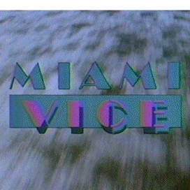
Retro80sfan Posted April 29, 2018 Report Share Posted April 29, 2018 (edited) Here's my correction of the "When Irish Eyes Are Crying" logo. I used the logo from the old Universal DVD's. I am now currently working on the first two seasons. Wish me luck! Btw, sorry if the below screenshot is smaller or low in quality then the above one, that's probably due to the apps on my tablet I used. Original My Correction Edited April 29, 2018 by Retro80sfan 2 Quote Link to comment Share on other sites More sharing options...
ViceFanMan Posted April 29, 2018 Report Share Posted April 29, 2018 40 minutes ago, Retro80sfan said: Here's my correction of the "When Irish Eyes Are Crying" logo. I used the logo from the old Universal DVD's. I am now currently working on the first two seasons. Wish me luck! Btw, sorry if the below screenshot is smaller or low in quality then the above one, that's probably due to the apps on my tablet I used. Original My Correction Cool pics! Correction how? Just curious. Your “correction”, or bottom pic, is pretty good...definitely closer to the accurate logo & what was originally aired. The blue is maybe not quite teal enough, and the pink is a little “hot” for MV...but this is close. Definitely better than the green & purple crap! 1 Quote Link to comment Share on other sites More sharing options...
Retro80sfan Posted April 29, 2018 Report Share Posted April 29, 2018 2 minutes ago, ViceFanMan said: Cool pics! Correction how? Just curious. Your “correction”, or bottom pic, is pretty good...definitely closer to the accurate logo & what was originally aired. The blue is maybe not quite teal enough, and the pink is a little “hot” for MV...but this is close. Definitely better than the green & purple crap! Thanks and yes, the bottom pic is my "correction". 1 Quote Link to comment Share on other sites More sharing options...
ViceFanMan Posted April 29, 2018 Report Share Posted April 29, 2018 Just now, Retro80sfan said: Thanks and yes, the bottom pic is my "correction". Nice job! I wish Universal would have “corrected” the Season 3-5 logos too. I’m lucky enough to have some original airings of episodes from later seasons, and the teal & pink logo was used throughout the whole series...where & why they came up with the green & purple “fake” logo for syndication I do not know! 1 Quote Link to comment Share on other sites More sharing options...
Retro80sfan Posted April 29, 2018 Report Share Posted April 29, 2018 (edited) 31 minutes ago, ViceFanMan said: Nice job! I wish Universal would have “corrected” the Season 3-5 logos too. I’m lucky enough to have some original airings of episodes from later seasons, and the teal & pink logo was used throughout the whole series...where & why they came up with the green & purple “fake” logo for syndication I do not know! Yeah, I also wish that Universal had put the magic back into the weak logos we got on the DVDs and everything else. I'm thinking right now that they tried to do it with a budget or some nonsense. If I could do this to a screenshot of an episode, imagine what they could do to all the episodes with all the right equipment! Edited April 29, 2018 by Retro80sfan 1 Quote Link to comment Share on other sites More sharing options...
ViceFanMan Posted April 29, 2018 Report Share Posted April 29, 2018 1 minute ago, Retro80sfan said: Yeah, I also wish that Universal had put the magic back into the weak logos we got on the DVDs and everything else. I thinking right now that they tried to do it with a budget or some nonsense. If I could do this to a screenshot of an episode, imagine what they could do to all the episodes with all the right equipment! Exactly! I think it was cheaper to use syndicated versions for the DVDs, and subsequently the Blu-rays ...but they really should have used original airings, complete with original logos. Quote Link to comment Share on other sites More sharing options...
Retro80sfan Posted April 29, 2018 Report Share Posted April 29, 2018 (edited) 56 minutes ago, ViceFanMan said: Exactly! I think it was cheaper to use syndicated versions for the DVDs, and subsequently the Blu-rays ...but they really should have used original airings, complete with original logos. Yeah or have them just find some old recorded videos of the original airings and just cleaned them up or whatever and just release it on Blu-ray, but of course, we know they're not gonna do that. All I know is I'm going to be keeping my original Universal DVDs close to me because in my opinion, they are closer to the original airings than the new DVDs and Blu-rays as some of the episodes haven't aged that bad. Not to mention the new DVDs and Blu-rays tend to "copy and paste" the same exact logo for each of the episodes in their corresponding seasons. Edited April 29, 2018 by Retro80sfan 1 Quote Link to comment Share on other sites More sharing options...
ivoryjones Posted April 29, 2018 Author Report Share Posted April 29, 2018 8 hours ago, Retro80sfan said: Here's my correction of the "When Irish Eyes Are Crying" logo. I used the logo from the old Universal DVD's. I am now currently working on the first two seasons. Wish me luck! Btw, sorry if the below screenshot is smaller or low in quality then the above one, that's probably due to the apps on my tablet I used. Original My Correction WOW!!!!! Fantastic Fantastic Fantastic!!!! What kind of tools you're using? Is it a real time playing like the "Intel(R) HD Graphics 4000" control panel (or later), or is it an image editor or something else? That is a terrific job! 1 Quote Link to comment Share on other sites More sharing options...
Matt5 Posted April 29, 2018 Report Share Posted April 29, 2018 1 hour ago, ivoryjones said: WOW!!!!! Fantastic Fantastic Fantastic!!!! What kind of tools you're using? Is it a real time playing like the "Intel(R) HD Graphics 4000" control panel (or later), or is it an image editor or something else? That is a terrific job! A really fantastic job! 1 Quote Link to comment Share on other sites More sharing options...
Recommended Posts
Join the conversation
You can post now and register later. If you have an account, sign in now to post with your account.