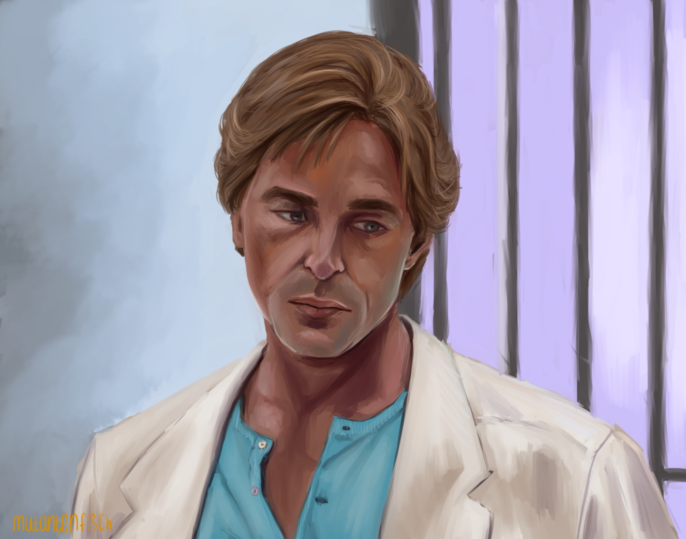
Tourist 32 Posted September 21, 2020 Report Share I mentioned in 'Sketches' that I could take screenshots and compile a step-by-step and so I did, for "Grow up". Figured putting this in the comments wouldn't be a bad idea because it's easier to arrange pictures in a certain order that way and I have the advantage of adding text. So - here we go with my usual progress while doing digital art. Step 1: I opened up the usual background layer and threw a completely eye-balled sketch on a transparent layer above. Nothing too detailed. I just want to get the proportions right. Step 2: On a new layer, which I forgot to screenshot, I used the blue wire frame from Step 1 to narrow down the details. That stage looks messy as hell and I am grateful for working with two monitors, that make comparing to the reference so much easier! On top of that layer I sketched the "final" lineart layer. Since this study was again with a more painterly approach in mind, the lineart is as sketchy as you see it here and not very polished. Step 3: Deleted the wireframe like I did the initial sketch to save RAM. (I know I sound like a madman, only using a minimum number of layers for everything, but my poor RAM would die if I didn't). On the background layer, I used the aforementioned oil brush at maximum amount and density of paint to block in the base colours. I sort of eyeball everything and to be frank I know about colour theory but still don't understand it after spending the better half of my 24 years doing art. So take this with a grain of salt. What I did, though, is deliberately changing some colours a little, compared to the screenshot. Mostly the colour of the wall behind Sonny, because it is almost the same shade, just darker, as his jacket. Step 4: Let's get down to business! I added some contours underneath the red lineart layer to get the right proportions, then set that layer to invisible and blocked in the highlights and shades on his face, neck and hair while toggling it on and off to see if I hit approximately the same spot. Then I deleted that lineart layer as well. As I said - I mostly use the same oil brush that comes with the default package of Clip Studio Paint, even though I've installed a number of free custom brushes that I use for special effects sometimes. I just crank the amount and density of paint, brush density and size up and down as I go and need it and so far this brush has made me very happy. With these studies I'm trying to use not too many different colours but still make the art interesting to look at. Here this was a bit more difficult than I initially expected to be because we have a very limited palette with not that much contrast. The slight reflection of the pastel blue t-shirt on Sonny's lower face and the light on his left side made this still stand out for me though. As did his expression, which was quite a challenge. Step 5: It looks like a lot has happened, but basically I just alternated between lowering the oil brush's amount and density of paint and the brush density to a very low number and blending everything, using the colours that this produces to make the blending smoother, and cranking these same settings up to render his face and hair in more detail, paying attention to how the light bounces off his face and hair and where the shadows lie. I could've taken a dozen screenshots in-between, because this is the most time consuming process, but in the end you wouldn't end up seeing that much difference between each step I think. Step 6: Final step before finishing - I avoided the barred window/door while painting the rest because straight lines are a pain. However, most digital painting tools have a shortcut for doing straight lines; with CSP it's clicking the starting point and then holding shift and dragging the cursor with the line where you want it to be. I used that to quickly clean up the bars and then slowly blended the edges to achieve a slightly rounded and a bit more blurry "background" feel for them. You can see that in the finished painting. I also added some tiny details and texture on the t-shirt and jacket with the oil brush at a very low size and the coarse brush I mentioned too in "Sketches". And that's basically it. As I've mentioned before - a rather painterly approach to digital art, but then again I've been doing mostly trad art until I was in my very late teens because graphic tablets are expensive as hell and painting with a computer mouse is not very ergonomic. So I think a lot of my traditional approach still sticks. Nowadays I'm 90 % digital because no matter what time of day - the screen is always lit up to work with and it's a lot less messy and space consuming than painting on cardboard or canvas. Plus - I don't need to buy expensive colours and can instead spend that money on DVD boxes and the likes Quote Link to comment