Leaderboard


Popular Content
Showing content with the highest reputation on 08/06/2020 in all areas
-
Who wants to join me? Let's party!!3 points
-
2 points
-
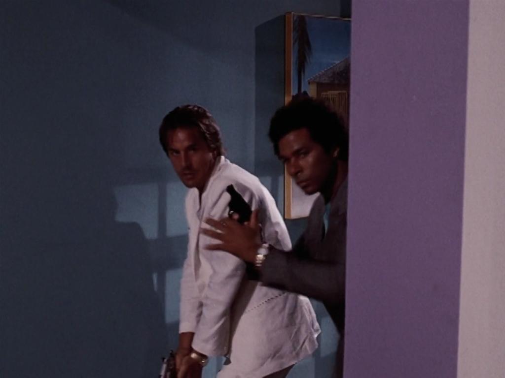
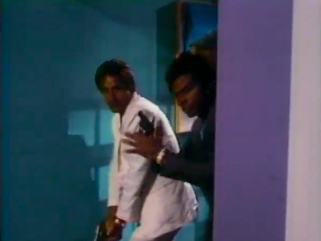
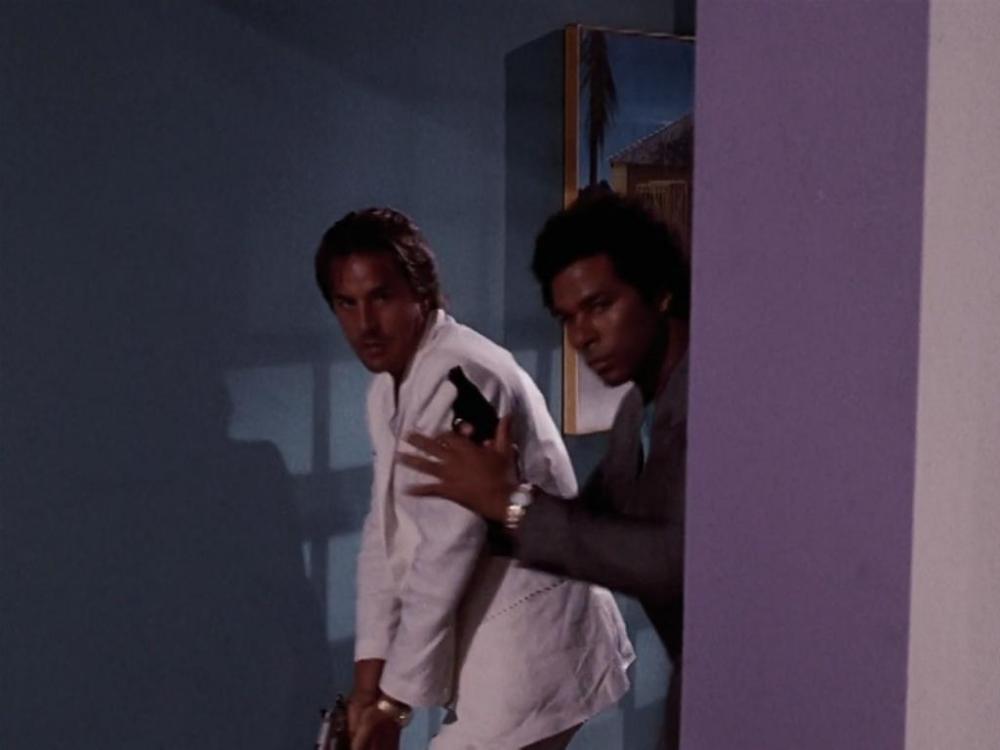
10-4 Just to play Devil’s Advocate. The unique railings are rectangle in rectangle breeze blocks, very popular in places like Miami. Some privacy while letting the breeze thru while providing support/security. The “Left Cage” doesn’t work as the stairway is there. The direction C&T pull Tucker out of the kitchen, would mean they pulled him from the stairway to the breeze blocks. Blocks at Tuckers back and right side. The other side doesn’t work as it’s a doorway to the unit. The balcony is on the apt is not wide enough based on the picture above of Tucker against the breeze blocks. The doors out of the kitchens, units with doors exiting the kitchen of the units at 260 Ocean Drive that have them are too small vs what is shown on the episode, 2’6” vs 3’ door and exit to a balcony, not the caged area. I also don’t see any with what appear to be stoves/ranges right next to the door. The exit doors on every unit I looked have thresholds, the photo above where C&T drag tucker outside, does not. Plus it appears every unit’s front/entrance door opens to the outside, no hallways as shown in the episode. My thoughts. The unit in the episode has a pay phone inside and the girl by the door is fiddling with a switch that has a steel cover, very odd for a home. When Switek and Zito rush in, we see the entrance door to the unit, again no threshold, unusual for an apt/home. There appears to be an interior latch for a deadbolt or other security device. The door edge itself does not have a hole for the bolt or if it is a bolt,barrel type, there is nothing on the door jamb to catch and secure the bolt. When they bust in the door doesn’t fully open as it appears to stick on the floor/carpet and Zito bumps it to get it to open more. Almost all the interior walls are black and the ceiling in the back portion is at a different level than the entrance area, again something I don’t see at 260 ocean. The construction looks cheap, the door hardware and knocker appear to be brand new and the windows look back lit from above and the lower white ceiling appears to have a slight sag in it. When C&T pull Tucker outside, we clearly see grey plain unpainted concrete block behind them on both sides of the opening/doorway. No grey unpainted plain concrete block is exposed at 260 Ocean. Nor would you expect at an apartment/condo building. We also see some very basic black/purple cabinetry as they drag Tucker thru the door. We also see the stove and microwave next the door/opening. When Crockett gets up, what we see in the background thru the rectangle and rectangle block is that it does not match as we would expect to see the same color wall/block and pattern across the stair. We see some yellow, not pastel color. My WAG is it is a set possibly built off the kitchenette/breakroom at the studio. I plan to rewatch another 20 times tonight to see what else jumps out.2 points
-
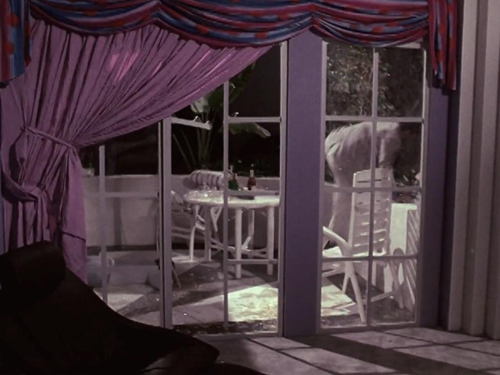
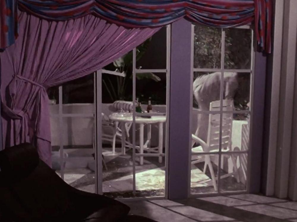
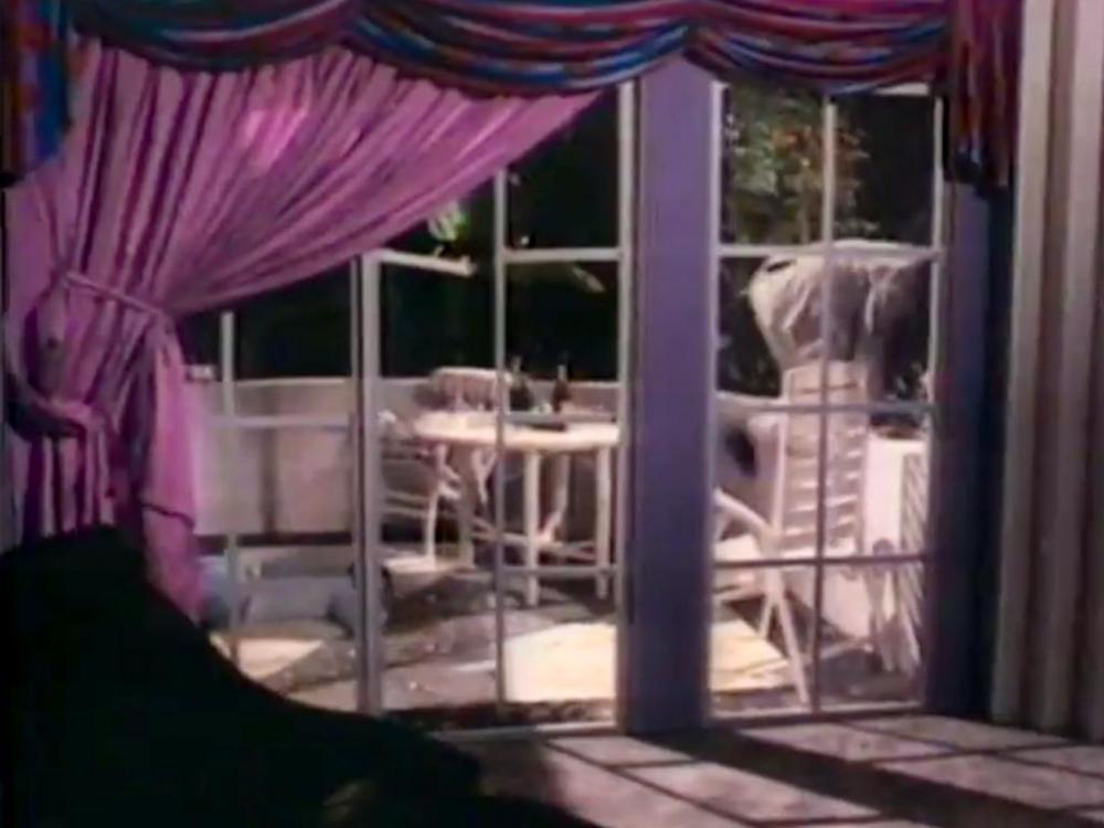
Just my 2 cents. In the episode the unique block is at least 4 courses high, the building above, only 3 courses high. Plus in the photo above noted as Veranda C&T&Tucker, there is only block on one side, in the episode it’s on 2. The Veranda is not part of the balcony and the balcony appears to be poured in place concrete, the pattern doesn’t match. Plus a door to the noted condo is in the Veranda, and that would probably make that the room behind the slider to the balcony an entry to a living room. And there is a small threshold 3-4 inches high to keep the rain out, in the episode it appears not to have a raised threshold. The kitchen’s in these condos are real small and only a single door, no sliders so no way C&T&Tucker could fit thru it. This unit appears to be the mirror image of the unit noted above. https://www.realtor.com/realestateandhomes-detail/260-Ocean-Dr-Apt-1_Miami-Beach_FL_33139_M69487-61572#photo52 points
-
Oh well of course. Even I would have got that without the jelly filling. At least ablind you could see.1 point
-
That's true about a bigger names and budget, but one of things I appreciate about the show is gives unknown actors a chance to shine on their debut, and it also gives unknown bands a chance to be heard on the biggest show at the time. I personally wouldn't like explicit sex scenes, it would ruin the flow of a episode and be awkward to say the least. The profanity would make it feel ugly imo as well.1 point
-
“Hey Freddie, and you give me another SLICE?”1 point
-
Wow! My apologies to everyone! I had even googled “petro jelly” thinking Crockett was referring to the light color of the agents’ suits. This is right there with @timm525’s “ablind”!1 point
-
"Heart of Darkness" The name of the suits is actually Petrocelli and it is one word. It was the "jelly" that was throwing me off! https://esuit.com/index.php/mens-suits/29528-petrocelli-navy-blue-stripe-suits-29528.html1 point
-
Sent out a message to people who worked on this episode to see if anyone remembers the location(s).1 point
-
There is too much that does not match for me and my opinion is not a match so I don't close the book and add it to my site until I am. In the past I have thought that I found locations for sure based on items like this and wanted to call it but waited, investigated and was later glad I had not because I would have been in error and never realized it. I have no bias in judging it I am just not convinced. It maybe right but not convinced yet so I want more study before I call it. From my cursory exam the layout is not right and I don't see any logic in the building changes that would have had to have occurred. Where's the kitchen attached to the porch where there is now not even an interior? Where is the sliding glass door? Why is access to apartments from the outdoor courtyard now when it was an interior hallway in Vice? Why did they take a decorative concrete block wall down from what was likely 8 (def at least 5)blocks tall down to 3 and add ugly rails? Just need more for me before I move on because I want to be sure.1 point
-
Halloween (1978) Best ever!1 point
-
Correct. Also had Michael Ironside in his usual ball-busting type role. It was definitely a weird film, with some humor thrown in.1 point
-
It was inevitable that these two great sleuths would disagree about some location. I see it as a good thing as it helps to get us closer to the right spot. It's amazing what they have done.1 point
-
Just about what you'd expect from HBO. Nudity, language, etc. Probably more explicit scenes of drug usage. I'm not opposed to any of this but I like my "Vice" just the way it is thanks.1 point
-
 Sorry Sonny...It's now a kitten nursery.1 point
 -
Haha not this time - only a utilities truck.1 point
-
"Where's my Daytona pal?"1 point
-
I’m no expert on this topic but I have a friend who in the 90’s used to work in film processing for Deluxe film lab in Hollywood, the 100+ year old company. I learned a lot from him. Of course, now everything is digital. My understanding is that 35mm film like the ubiquitous Panaflex used for Miami Vice and most dramatic television for decades, has real issues with color degradation over time. If the negative is not stored absolutely properly, it can start to degrade in as little as five years! Also, the different colors degrade at different rates. Add to that the transfer to video, which is what we were watching in the 80’s, and there is an immense amount of variability in color possibilities. Even going back to the original negative for Blu-ray isn’t the “original” color because the negative has degraded and will have to be color corrected. All these steps, from the original film development to the video transfer to modern color correction involve decisions by individuals along the way. They all affect the colors. If you take it to its logical end, our TV choice and even our own vision affect the colors we perceive. Bottom line, I think it’s hard define precisely what the original colors were for any film. We definitely notice the changes over time, but what were the original colors...???1 point
-
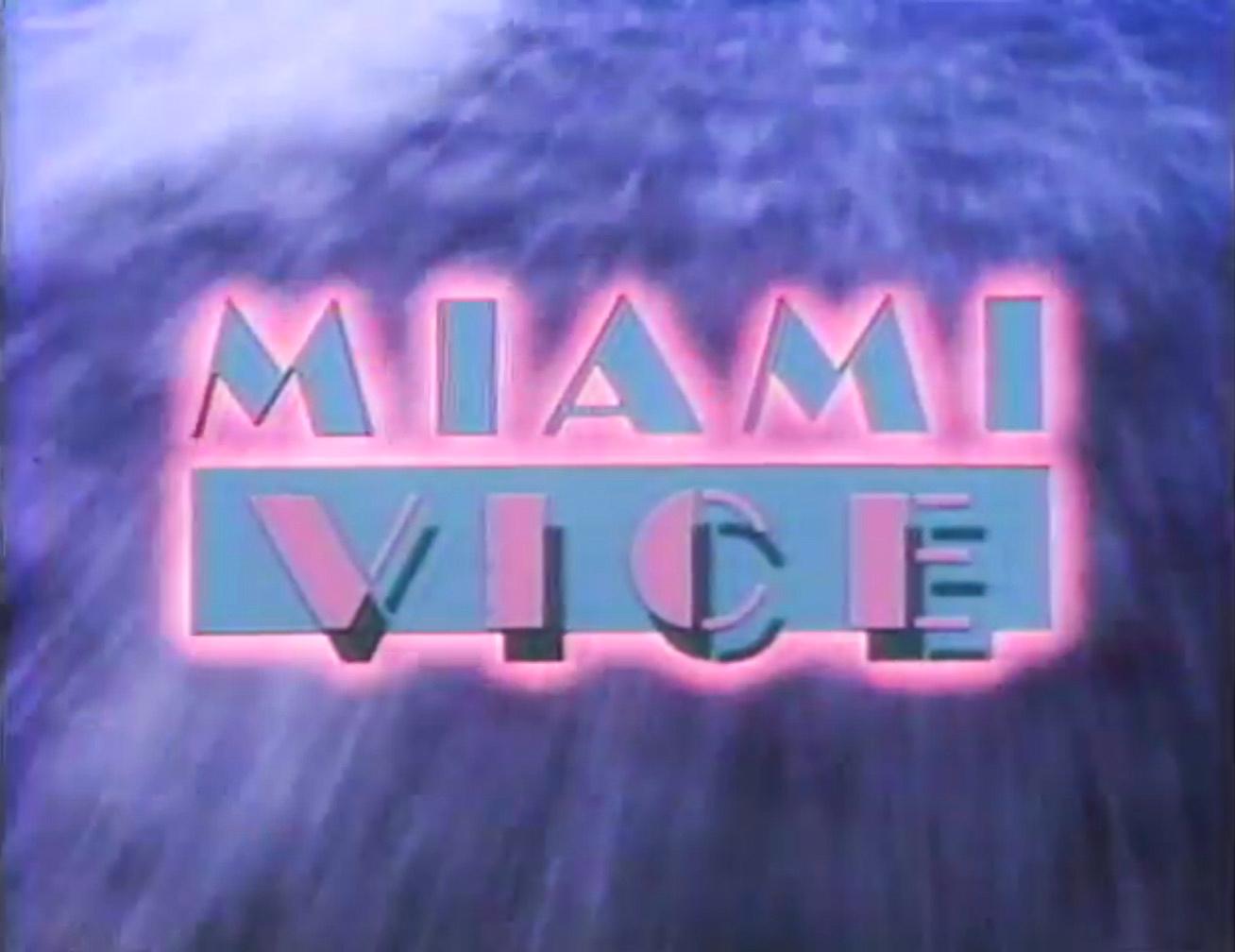
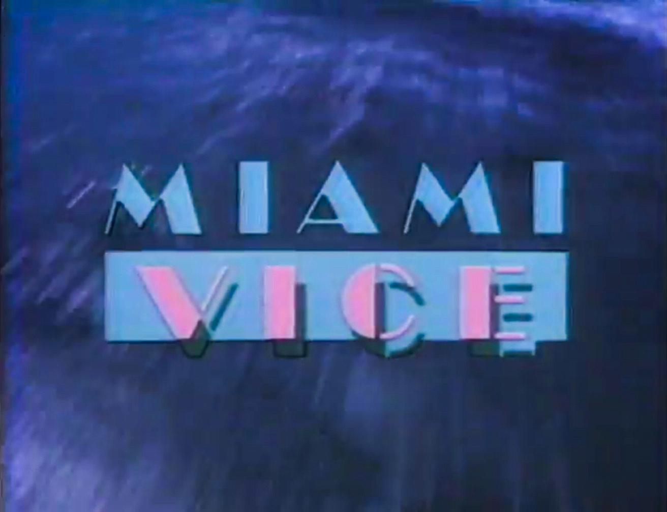
To this day, I still have yet to figure out why colors for the show logo & even certain scene clips were changed or altered for syndicated reruns and eventually the DVDs and Blu-rays (and subsequently eventually the streaming versions)? It literally makes no sense! I never have gotten a Blu-ray set yet, as I heard there were issues or problems with some of the episodes with quality and playback. I have, though, always enjoyed the quality and playback with all of the official DVD sets. However, the episodes used for the DVDs and Blu-rays (and streaming ones) are the altered/syndicated versions. But, several years ago I was lucky & blessed enough to be able to acquire homemade DVDs of most of the original NBC airings...complete with original colors, unedited scenes, colors of the logos, and even the original commercial-bumpers (back when they used to have a little still-scene advertisement of the show in the middle of commercials, saying “Miami Vice will be right back”)! They can talk about digitally remastered-shmastered all they want...in my opinion my ‘original airing’ set is MV gold! But, what I don’t understand is, if they went to all the trouble and money to make sure all of the original music and songs were used for the DVD and Blu-ray sets (which was the right decision, by all means), why would they not also make sure they used original airing episodes—complete with original colors, logos and unedited scenes?1 point
-
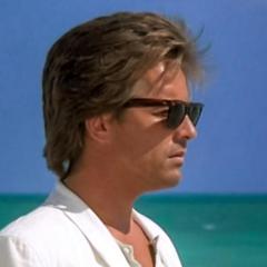
--bump-- I'm watching through this series again and here I am again wandering aimlessly through this thread trying to interpret the colors I see on Hulu as they were originally intended. Once again I am amazed and baffled by the lack of color in the streaming versions and the variations to the title colors. Anywho, I wandered over onto the official Jan Hammer youtube page and he's got a ton of great videos, interviews with him in the mid-'80s and showing a ton of footage from the show. For the most part they're good quality and some of the clips clearly show the much more vivid colors that has been talked about ad naseum here. I pulled some screenshots from this video, which is worth watching It's from right after Jan won his two Grammys so it's probably from around March '86, in which case this title sequence (glow and then no glow) is from somewhere in the first two seasons Then here's some clips from the official Miami Vice Jan Hammer music video, showing the stupid sh*tty streaming/HD/DVD colors... And as they appeared in the Youtube video Once again, stupid sh*tty streaming/HD/DVD colors... circa 1986 original So once again I'm left to wonder what in the actual f*ck happened to the gorgeous colors of this show.


 1 point