Leaderboard


Popular Content
Showing content with the highest reputation on 05/07/2024 in all areas
-
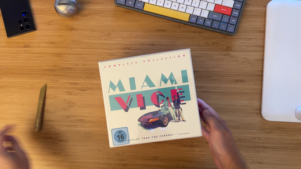
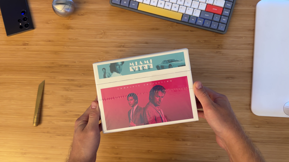
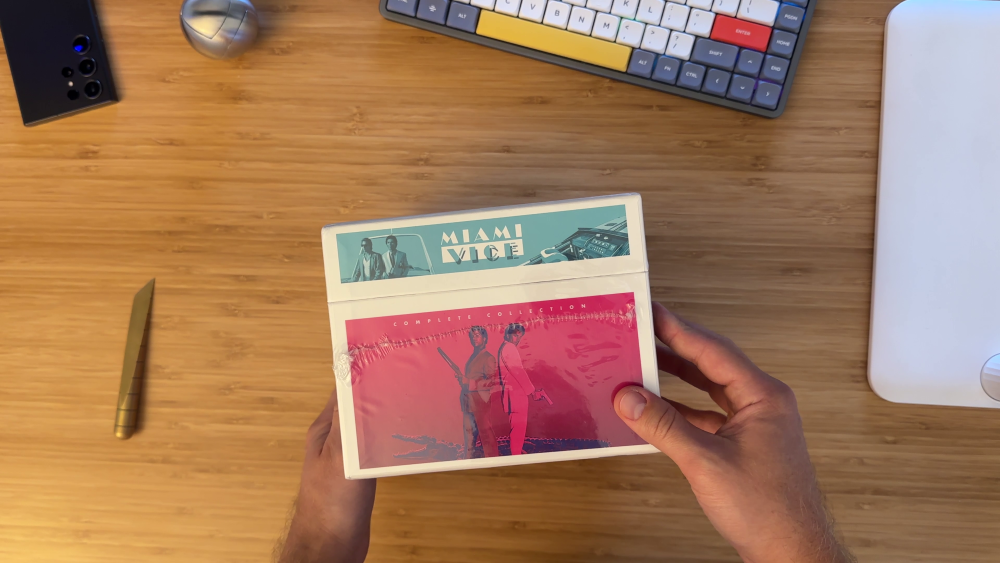
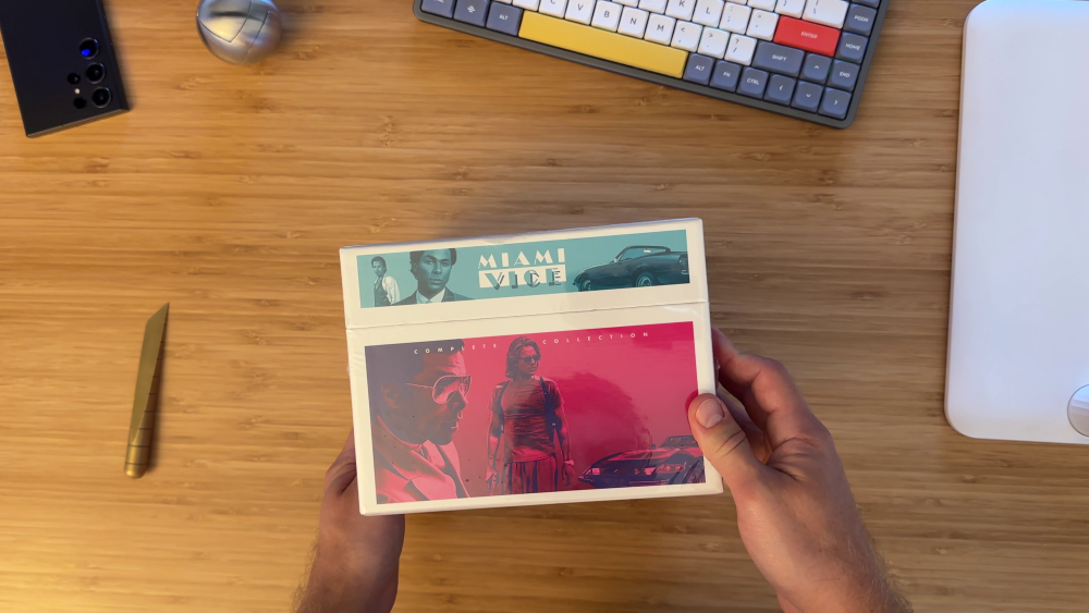
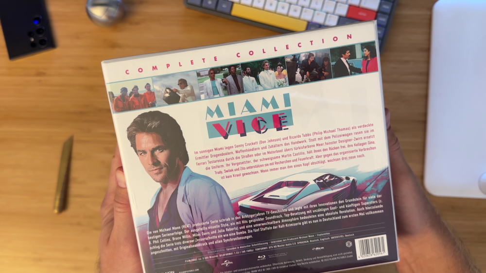
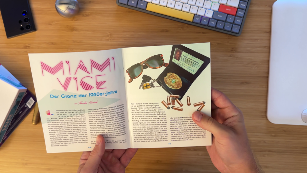
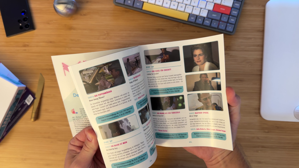
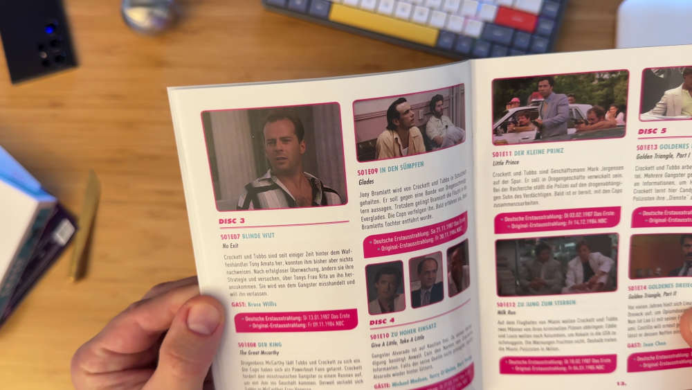
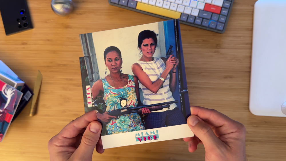
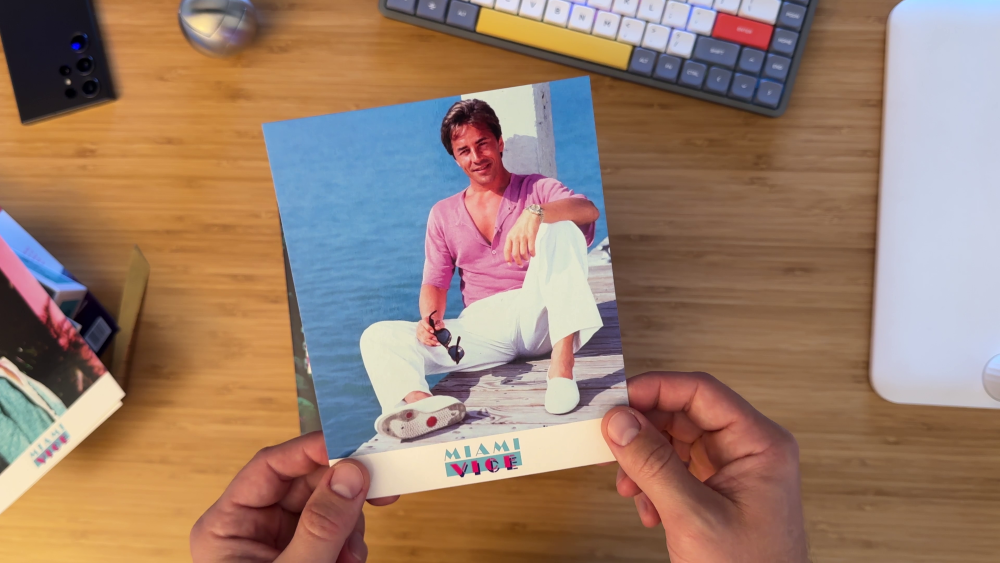
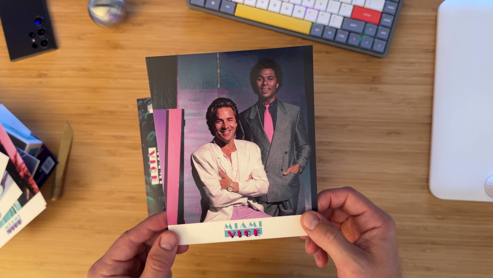
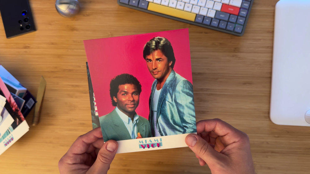
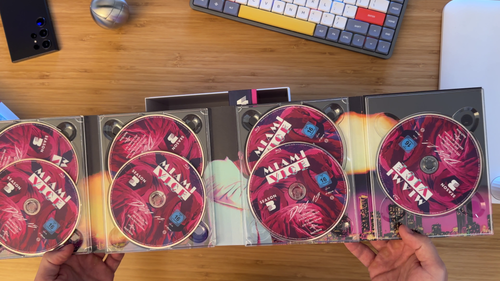
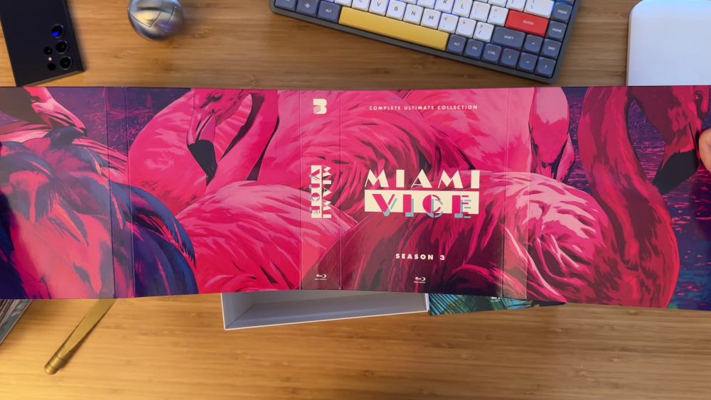
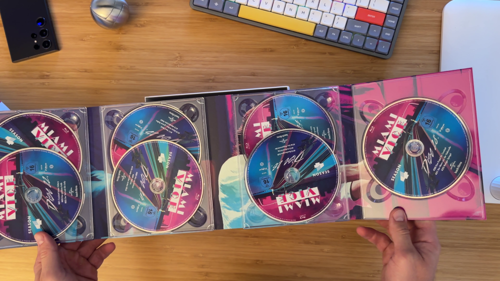
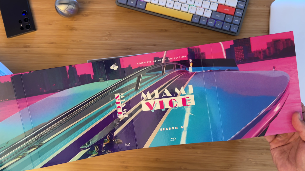
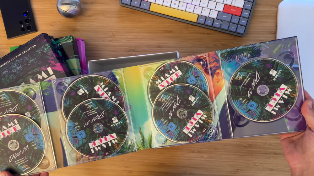
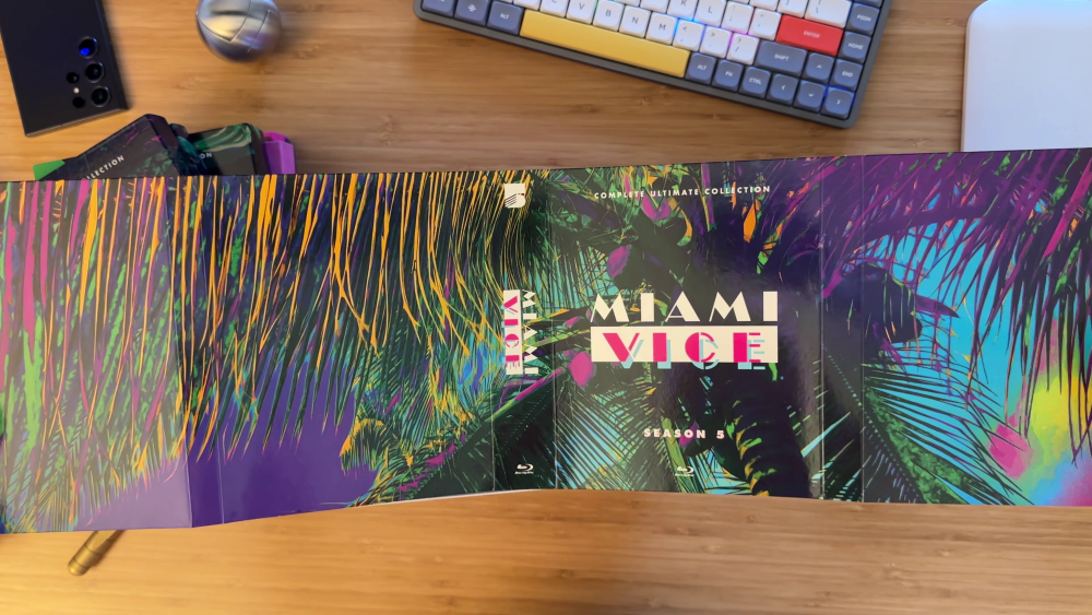
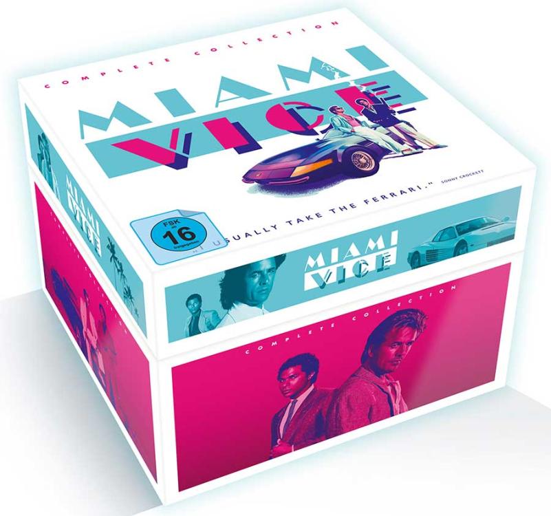
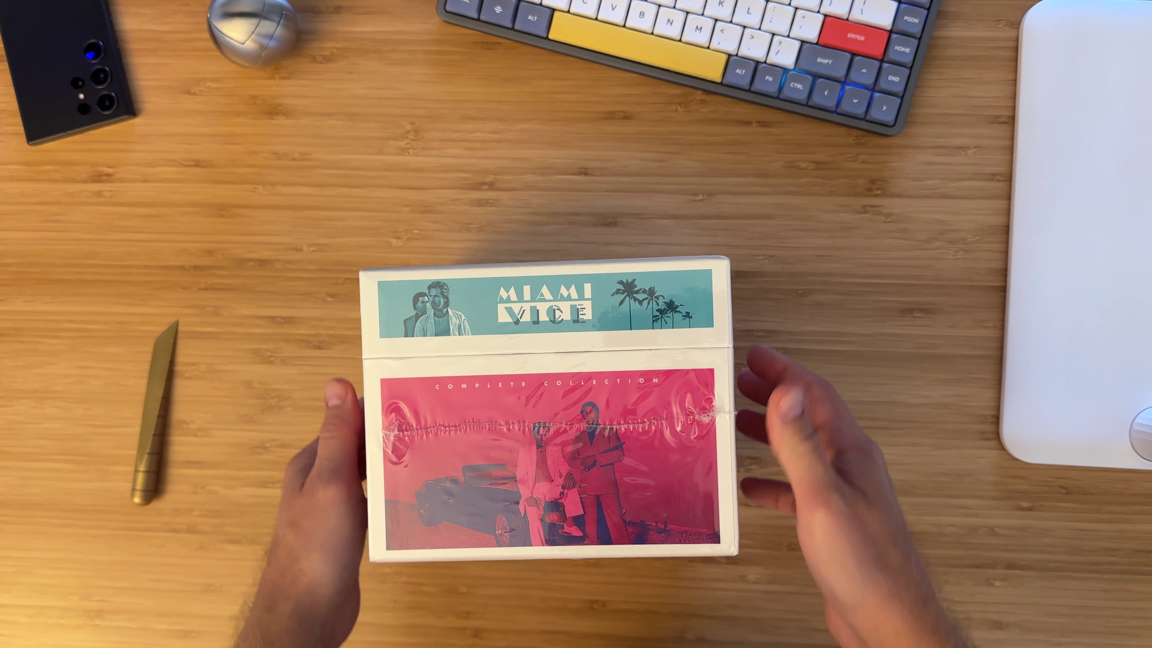
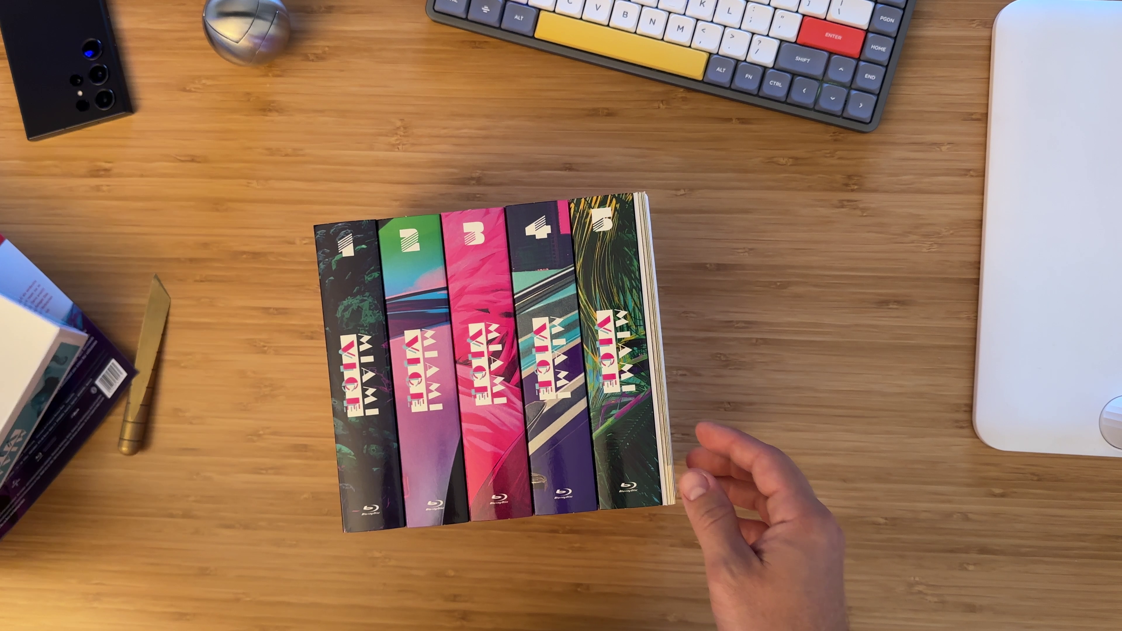
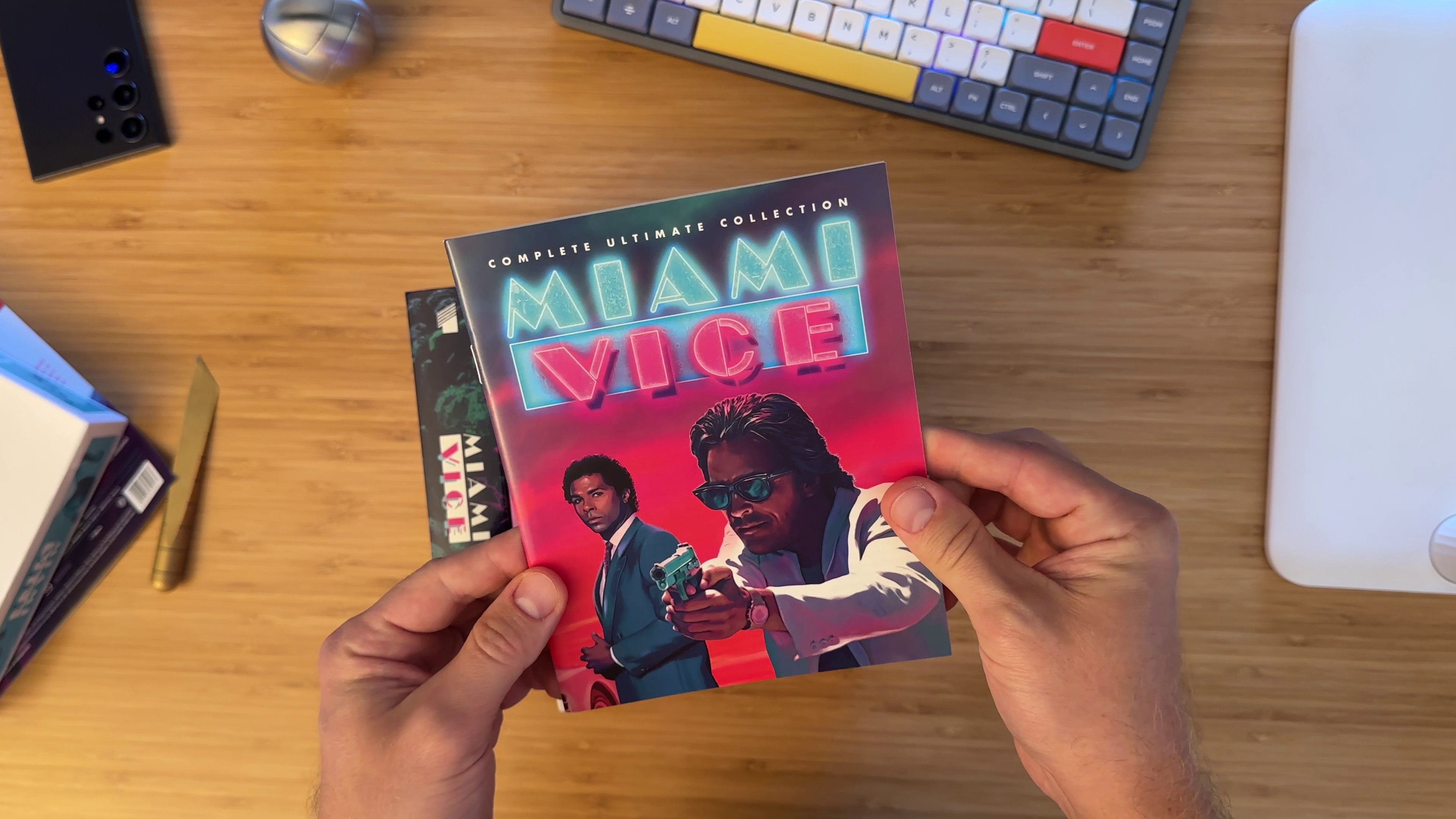
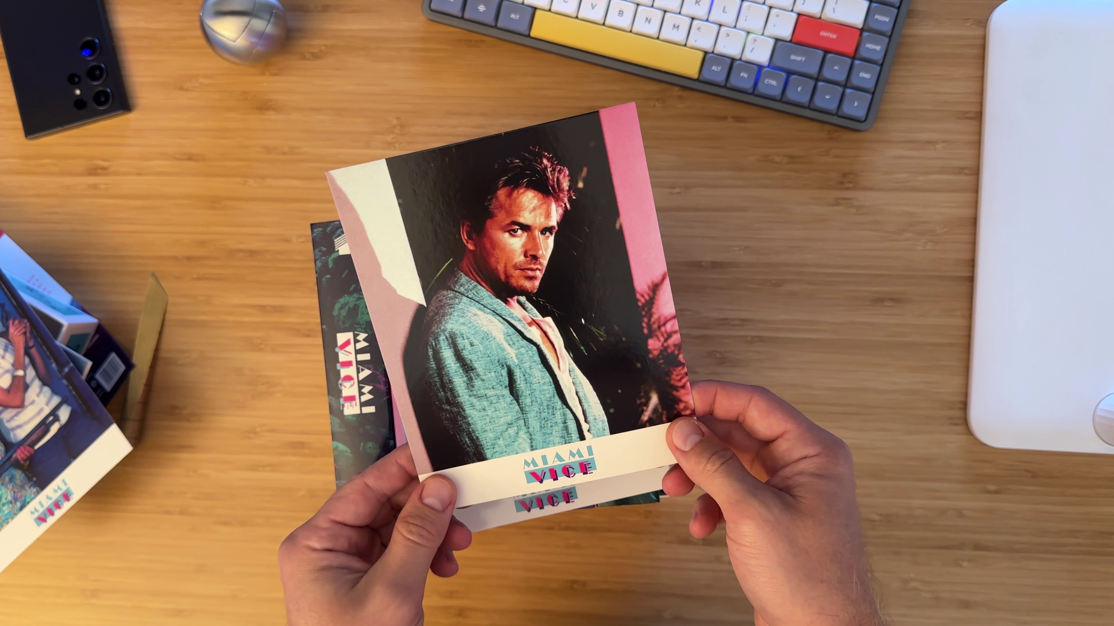
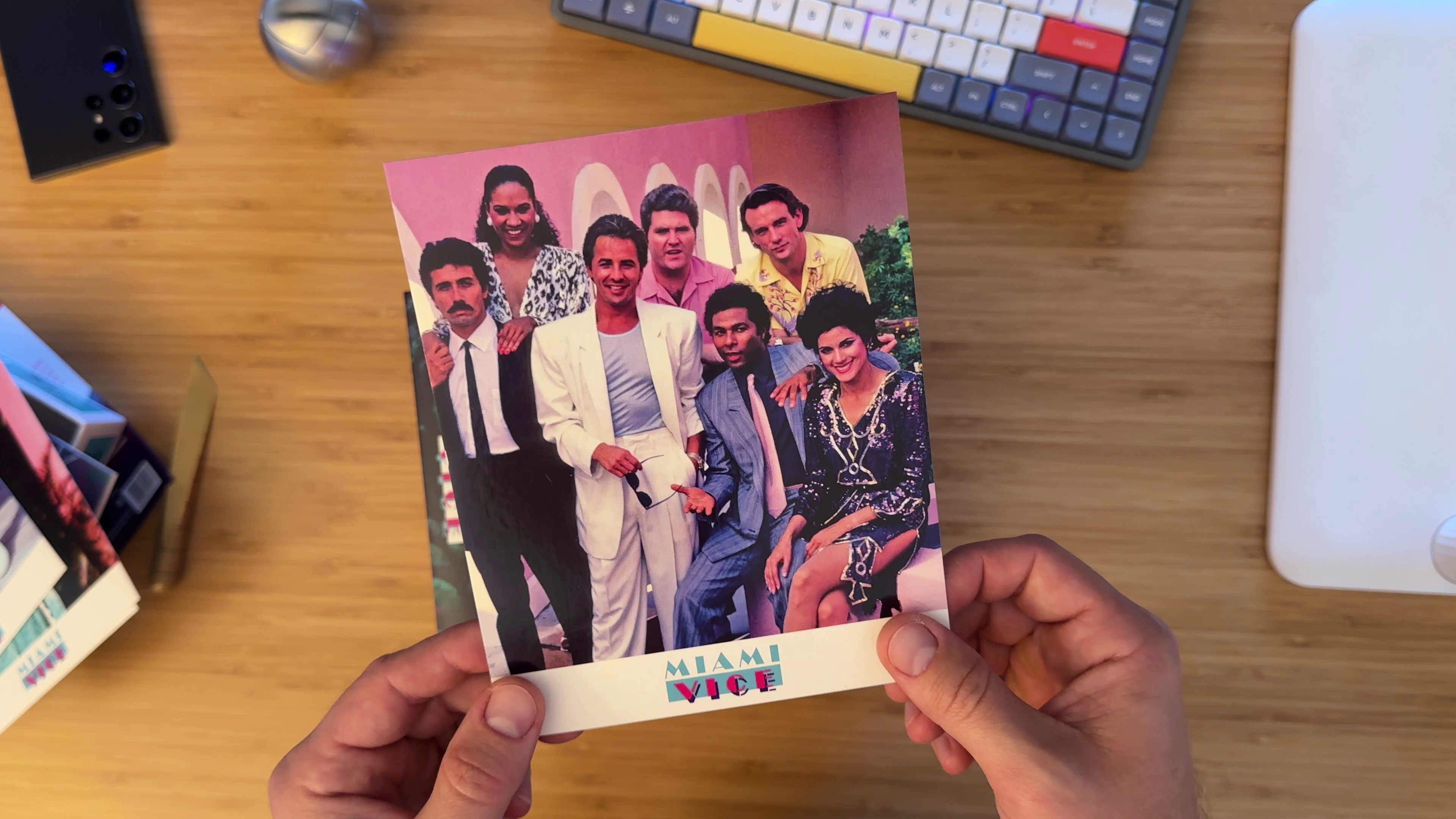
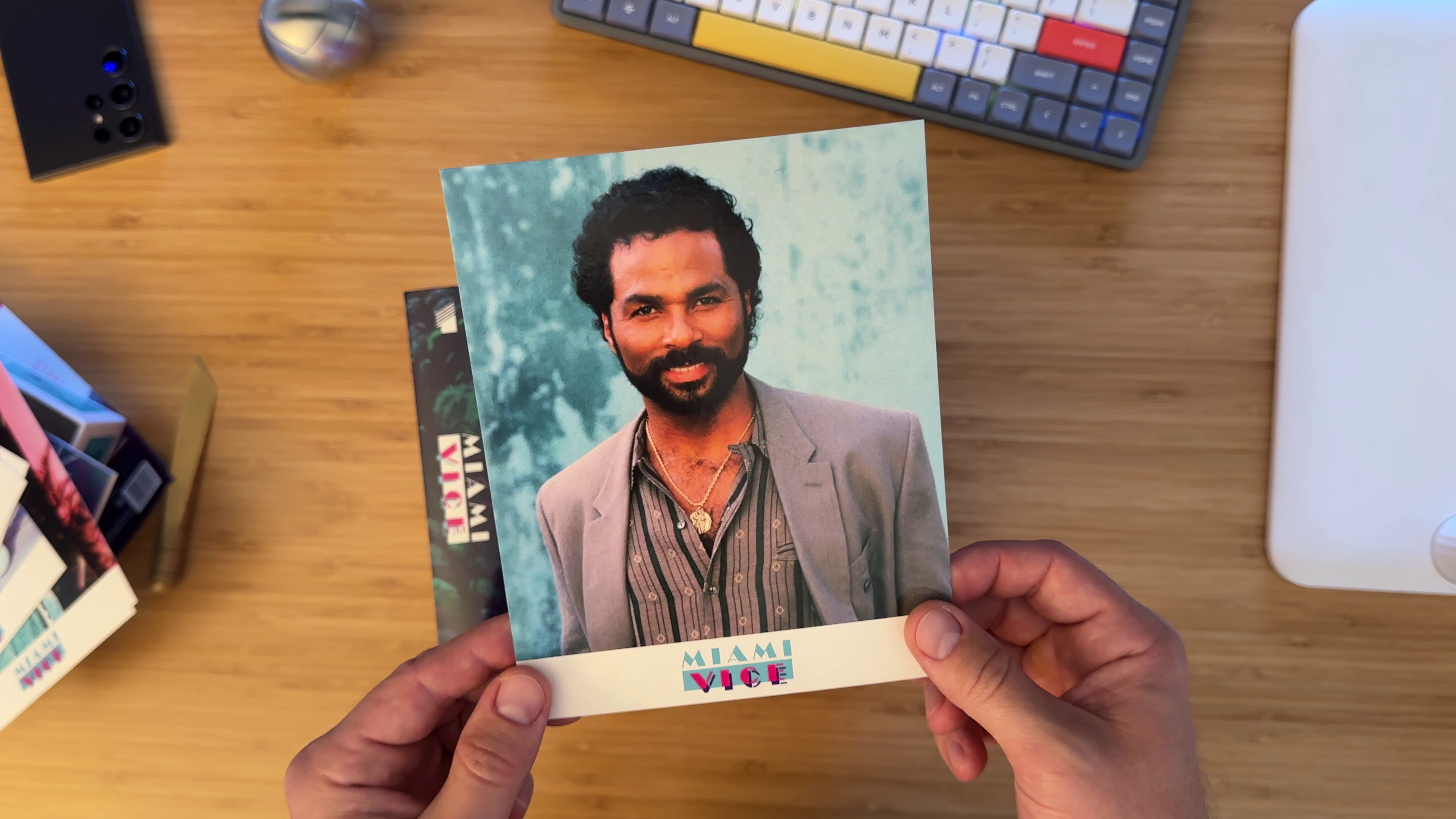
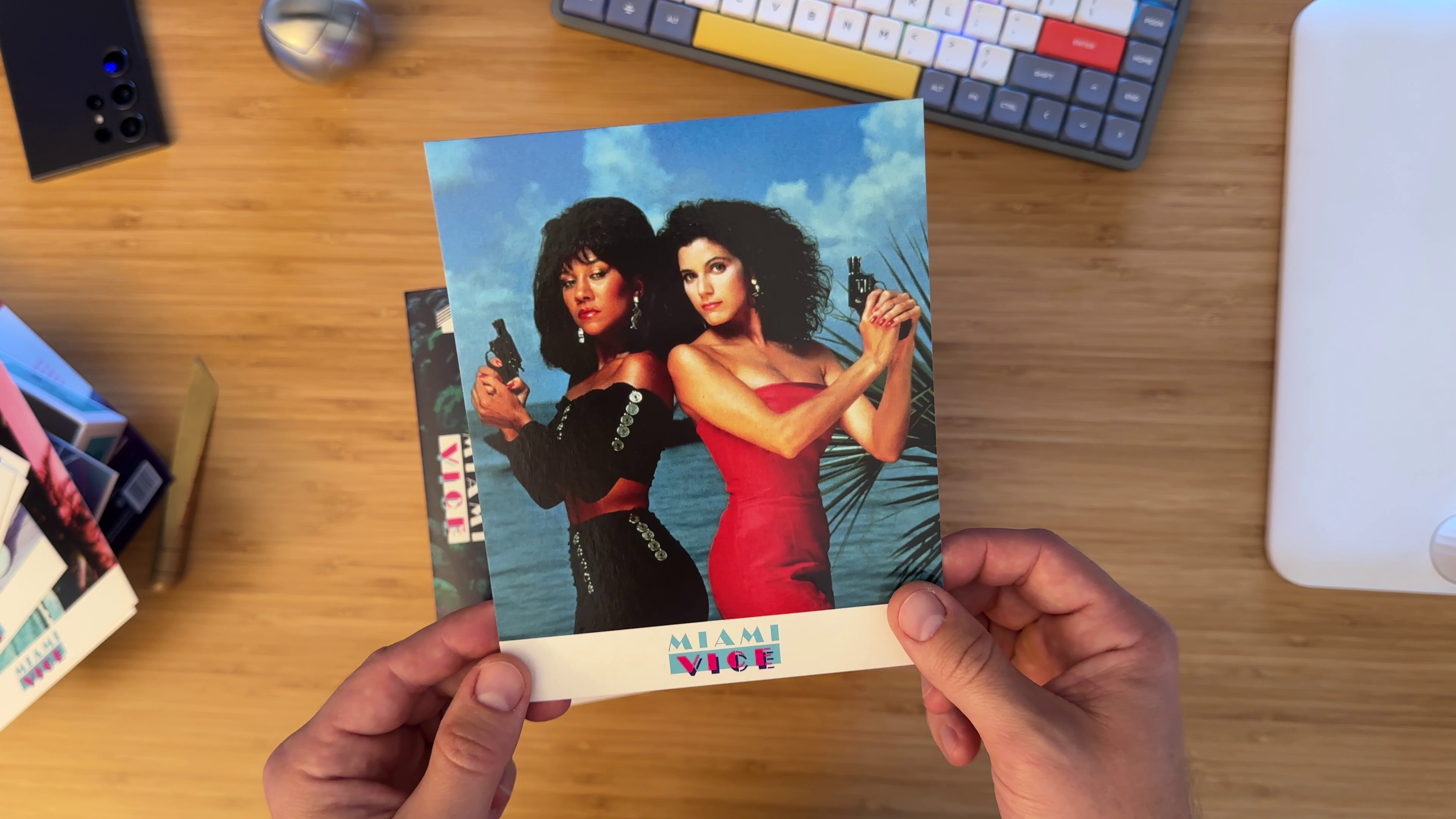
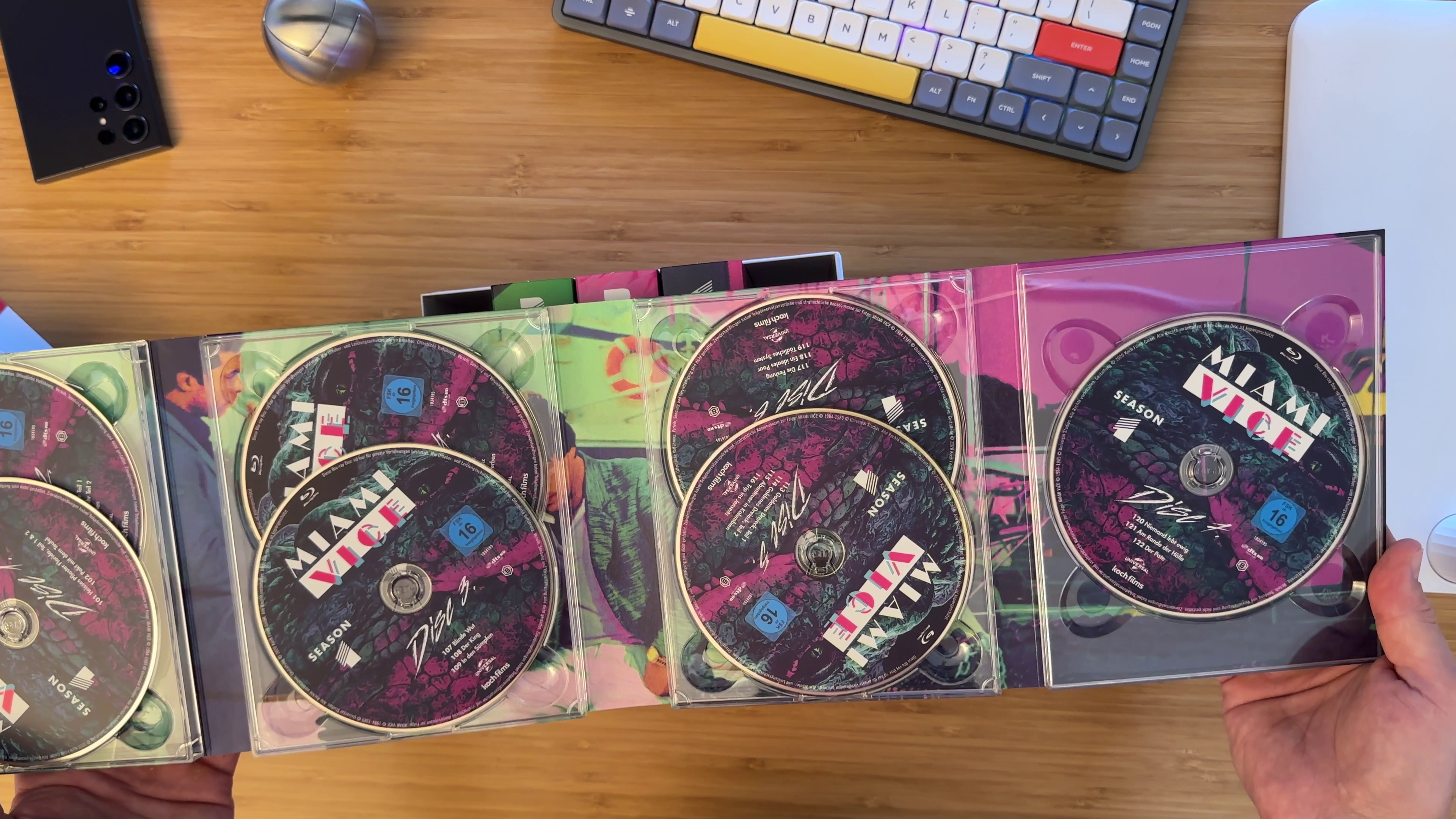
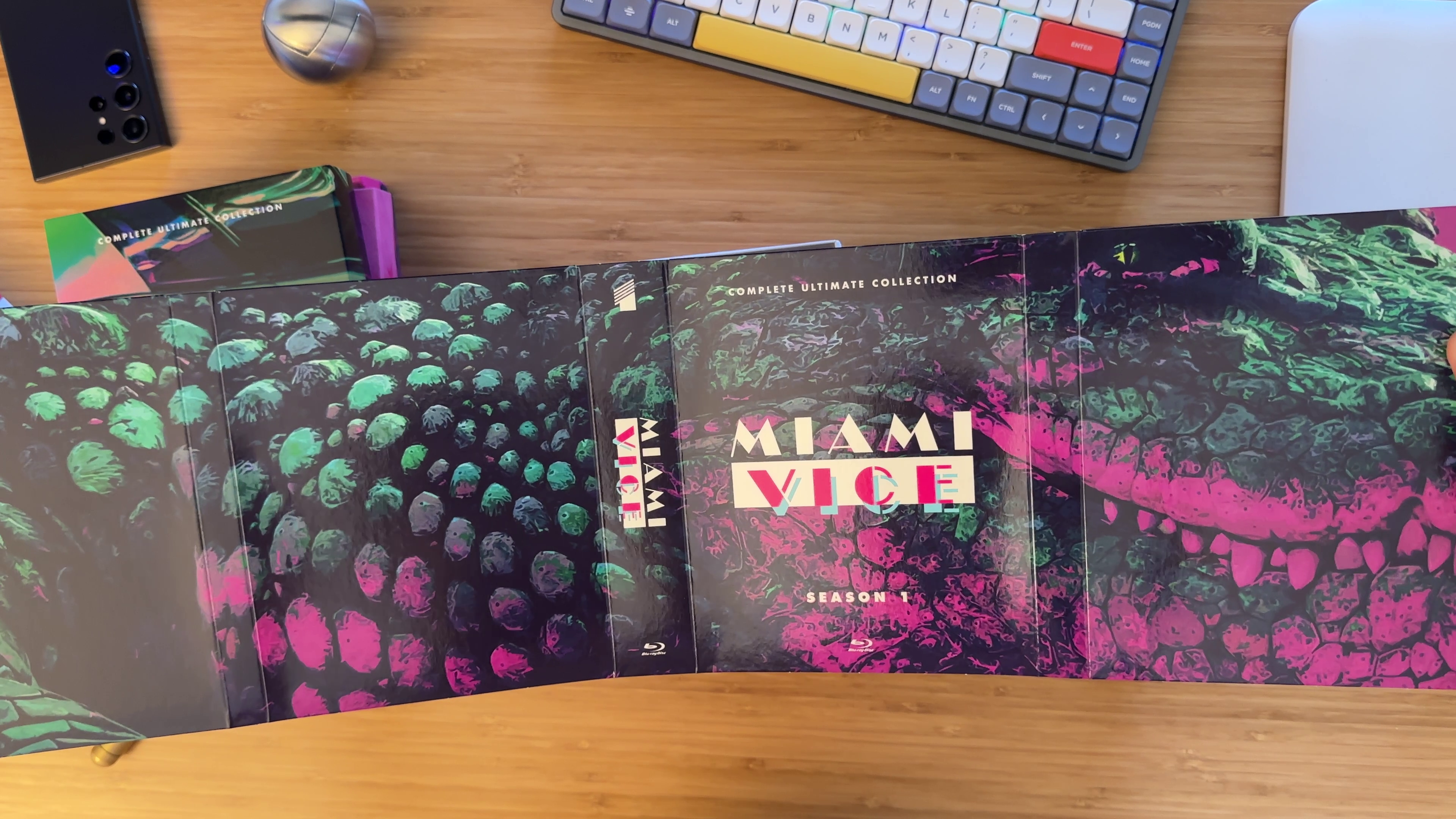
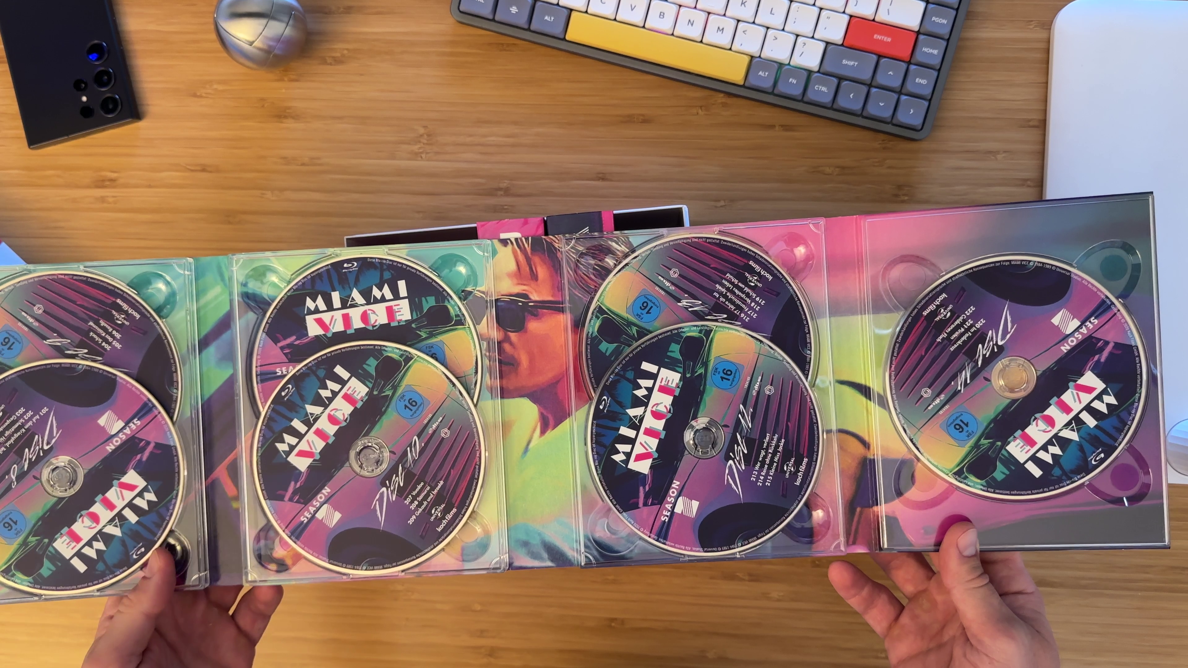
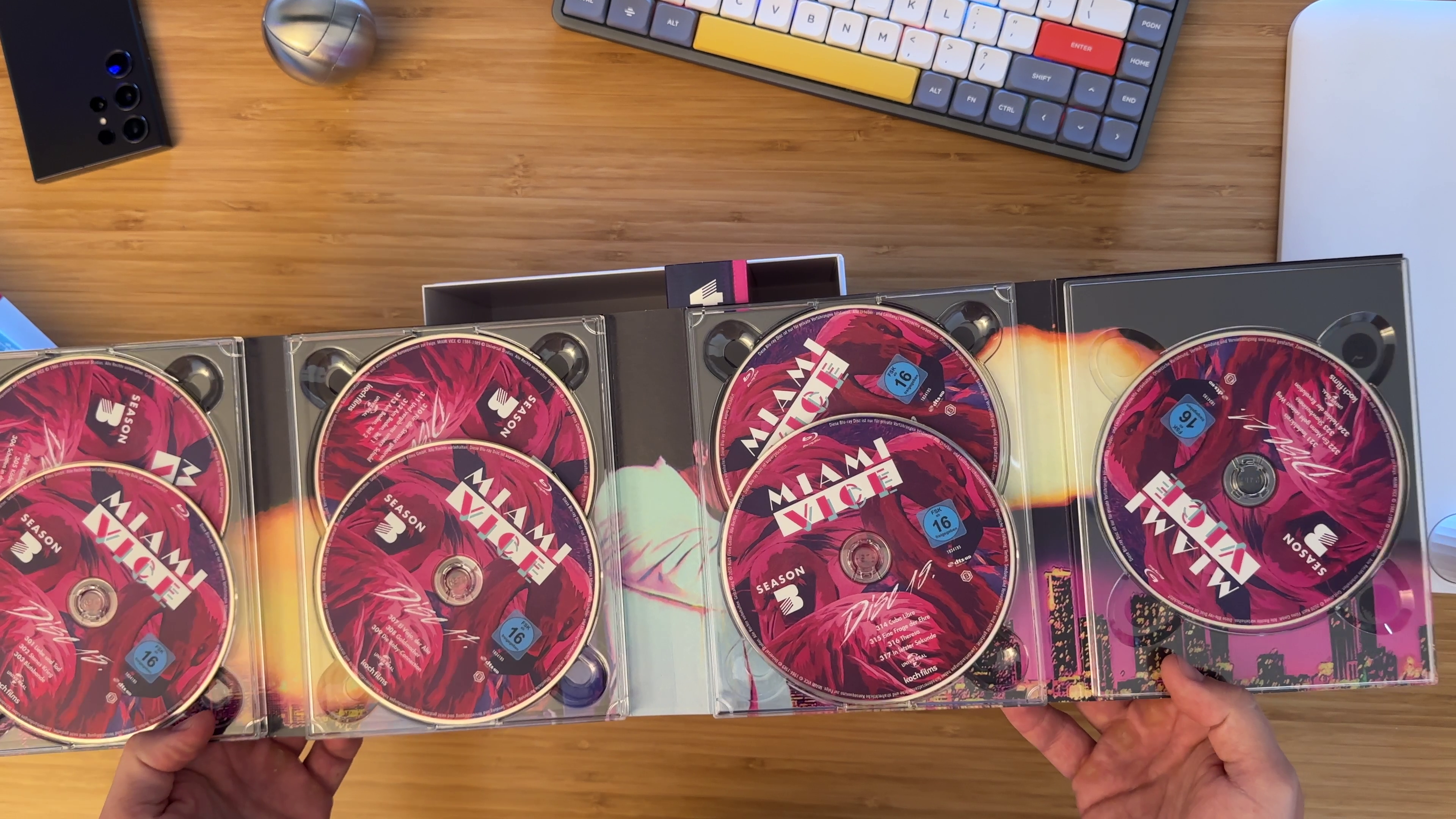
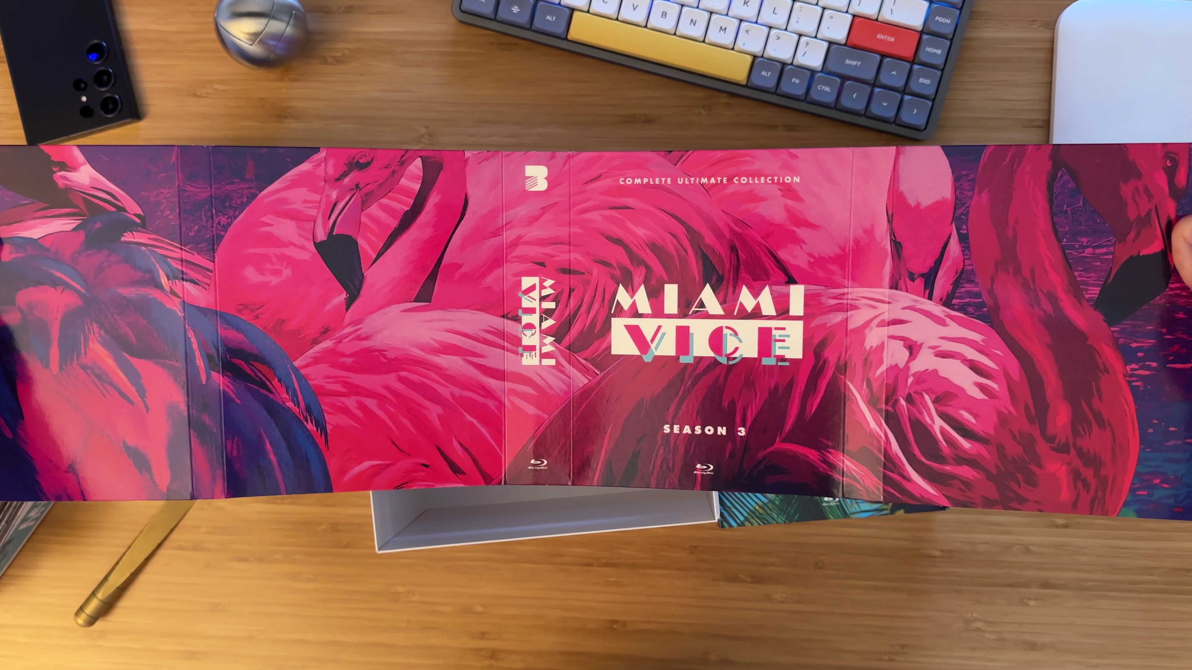
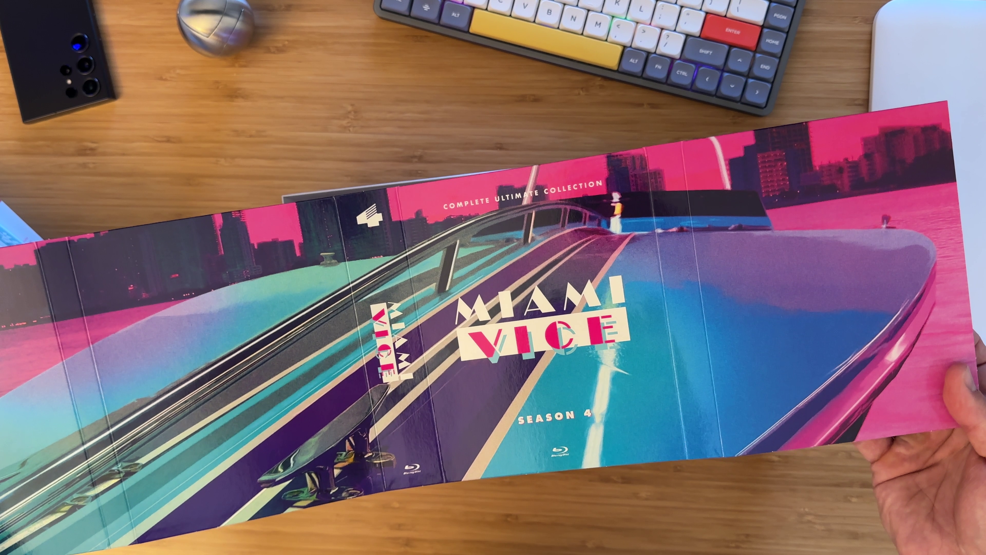
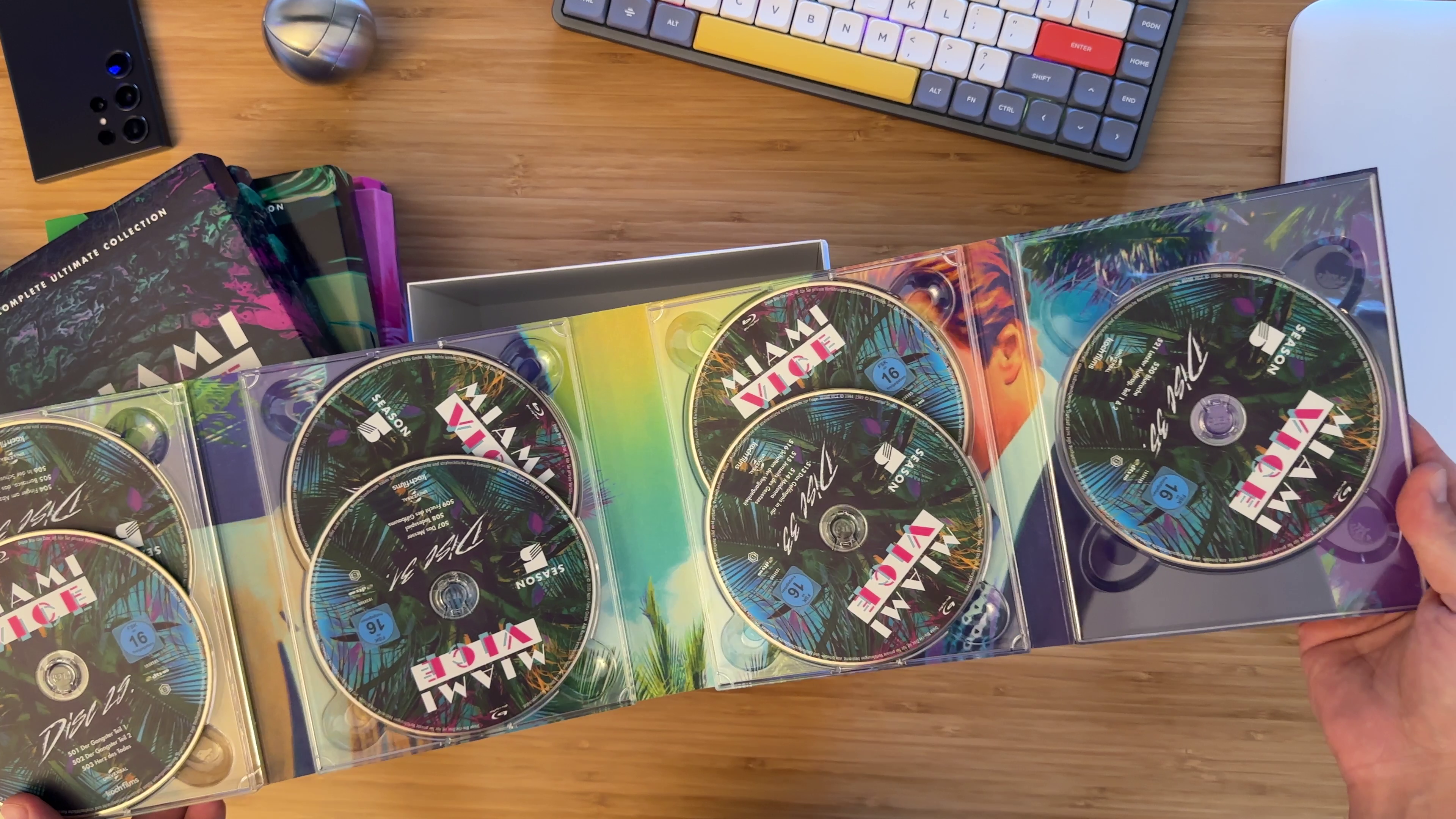
Through some serendipity I got my hands on... and pardon literally my hands in all the images below as they are screenshots from an unboxing video... the famed Koch Media edition! The video itself is 1.5 Gb so I won't try to upload it here, but I think it's good to add hi-res pictures of these treasured materials to the forum. How did this happen? I had a random thought some time ago of why would Koch Media make so few copies and decided I could maybe convince them to just make more given the rapid sellout of the first batch. So I just found an email address online (they are now called Plaion Pictures) and sent that suggestion. Somebody replied to me saying that "the edition is completely sold out and will no longer be available". I don't know if the problem was two English-as-a-second-language people communicating but she clearly misconstrued my message. I replied back clarifying I wasn't asking if they had more of the 2020 batch as I knew they didn't, but rather suggesting they just make another batch. She never replied back Well, to put it bluntly she really kinda lied to me during that communication anyway. A month ago I had a call with @Tom about something else and mentioned my conversation with Plaion. Upon a check - lo and behold Tom found out that Plaion was actually literally selling the second batch as we spoke! Why would she not just tell me that is beyond me but some 180 Euros and shipping across the pond later I finally have the box It is identical to the first batch except for the outer box design, which is now much simpler. I do like the original richer design more, but one thing that annoyed me on that box were some clearly New York City buildings in the Miami skyline, so I'm gonna go ahead and rationalize that the new cleaner design is truer and I actually like it better With that, here are all the visuals from the box, except I didn't flip through every page of the booklet and I didn't uncover backgrounds behind the discs - I'm just afraid to touch them


 6 points
 -
Enjoy the set! Especially the sharp and vibrant colors of the original 35mm film material that helped to solve half a dozen location mysteries that would have persisted otherwise. A typical example that comes to mind is the video dating service in Love at first sight whose (real) address was on the search warrant Tubbs showed to the owner but the print was so small and blurry on the US DVDs that we could not read it for months. With this set it was a crystal clear instant read off the screen.4 points
-
Wow! Loving the luscious vibrant graphic designs of the set!3 points
-
The Gas Monkey guys bought five red Testarossa's that were used and abused in the filming of the 2021 Mark Wahlberg movie "Infinite". So far, they have turned one of the cars into this for SEMA last year: https://www.thesupercarblog.com/sema-2023-ferrari-testarossa-ev-is-an-oddly-wonderful-restomod/ There are also videos on youtube about the conversion process. Pretty elaborate I must say.2 points
-
Wow! So awesome! Congrats! Super jealous. Thanks for all the photos!!2 points
-
Glades
 2 points
 -
chilly summer nights in Miami ?1 point
-
keeps you warm on chilly summer nights when cruising in the Daytona with the top down1 point
-
ok, it's not "THE" shirt, but you could already get a good whiff of the style while you keep chasing the real deal: https://www.ebay.com/itm/276288045176?mkcid=16&mkevt=1&mkrid=711-127632-2357-0&ssspo=Gn4Kn1x9S0m&sssrc=2047675&ssuid=ELNtyJkTQ2G&widget_ver=artemis&media=COPY1 point
-
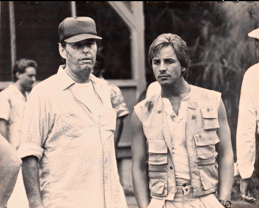
 As Tom posted a behind the scenes picture of him with EJO, I thought I'd check out his episode in Crime Story - season 2 - episode 9 "Love Hurts" This episode has tons of guest star actors seen in Vice, from Ismael 'East' Carlo to Bruce McGill. Directed by David Soul and written by Chuck Adamson and Gustave Reininger "Forgive Us Our Debts"1 point
 -
"Fruit of the Poison Tree", Part 2 aka, "the fifth Burnett episode" He doesn't even look at Gina in his dream. He never has a single flashback about her, over the course of months, not that we can tell. Ever wonder why? Sonny is obviously very isolated for the Burnett episodes, including in his own mind. Gina may be even more isolated for this one; even though she's supposedly in contact with OCB, she's still clearly living very much in her own world with her own fake identity, right up until Sonny and Rico arrive just late enough. (Sonny also has to wear a bunch of dark things in this episode because someone has made off with his pure-white shtick.) "Poison Tree" has an almost-identical opening to "Hostile Takeover" (you can guess which's which): Gina's dress actually shows up at Celeste's party, on a blonde woman with a face we don't see, before we even and right after we see Celeste: And now it's time for the person who set this up to pay. A little hard to know if that's a jacket and t-shirt or dark shirt and tie, at first glance. A little hard to tell which "pretty boy" she's pointing the gun at, for symbolic reasons... Forgiveness? Maybe. But whether there's one or two or however many Sonnys, you can't see his face. Celeste is blonde, but there are multiple occasions her hair is made to appear black, either by wearing something over or near it. See the white flowers on the bottle Sonny's drinking out of...? ("Who are you?", indeed...) So– he never calls Gina "baby", before "Poison Tree"... but he does call Celeste that, a couple of times. With all the references to the arc in the episode, Sonny may not be Burnett anymore, but it probably makes sense that some things from that period are carrying back over. Especially with his chain of calling Gina "Caroline" and calling Celeste "Caitie"... especially if it's heavily implied some part of him was always viewing Celeste as somebody other than that, too. Why is Gina absent from the Burnett episodes? She's not. She's present on a different level. (Then she gets one of her own.)1 point
-
Having said all of that ^ I must say that I very much prefer the new revised box design, I think it's much more elegant and in keeping with the series imho. Also cool they're doing it again to spike the ridiculous eBay prices. I guess that's why they've not gone for standard packaging to save some space, as they don't want it to be less than the previous in any way - so not the standard reissue I was looking for, but a whole lot better than the discs being unavailable. And that new box is niiiiiice
 1 point
 -
So Folks.... German Label Koch Media (now under the new Name Plaion Pictures) will after more than two years Re-Release their very popular Miami Vice Blu Ray Boxset! As it seems at the moment It will be Shop Exclusive like the first release but at least available again! It has the same Discs as in 2020 but in a new packaging with new design. It will be available in December. As soon as it have a pre-order Link and Pictures of the new Artwork i will post it here.1 point
-
Cool. And not to contradict, but just for the interest of reading the other side of that same coin, see the quote below. But as the man says, whatever works and on the business of the Koch art, which is completely subjective, but I didn't say whilst it was still available as I'm not here to discourage people, but as it's now a done deal; The lid always looks like it is on wrong because no sides of it match the art below it; and the art style reminds me of that you get on the side of fairground rides, it's all based on photographs, but captured in a garish style. A much better take on the same thing can be seen in this officially licenced t-shirt graphic (second of the two images below), which is doing the same thing, but without rendering it in a clumpy way and done by someone who clearly got the memo about use of colour in the show. It's 100% a matter of taste, but no contest, for me; But again, whatever works, just my view. There is no right or wrong and if people enjoy what they enjoy, I am not here to criticise that - I'm just sharing my view on a pet subject1 point
-
Koch used the same Masters as Mill Creek. But Mill Creek presented them wrong. They were too washed out color-wise and the encoding is problematic. Mill Creek is a budget company and it shows with their TV Releases. Off course for 50 Bucks you cant go wrong. And its still miles better then DVD. But Mill Creek didnt do anything with the masters they got. Koch did everything they could with the dated Masters. Koch ist not a standard company. They do a lot of restoration work with Companys like LSP Medien. They just did for example the 4K Restoration of the 1984 Dune Movie. Same Restoration also used on the Arrow UK Disc. They know something about film Of Course you can still dislike personally the results on Miami Vice. But i dont see colors/lighting too bright and neon. And Koch also repaired a lot of the English Audio Problems (for example the missing line in sons and lovers) Here are some comparisons i did between Koch and Mill Creek: Cool Runnin: https://slow.pics/c/1eOp19Ho As you can see the mill creek is brighter here. The Great McCarthy: https://slow.pics/c/r3ZMj0Da Here you can also see the much better compression of the Koch. Grain is better resolved and no artifacts. Also the Mill Creek is just too bright. Out where the buses dont run: https://slow.pics/c/G2L3ghkz Same here. But also you also can see: On most episodes the differences in Color are not that big because those are the same masters. Koch just encoded them much better and with the correct black levels. Or you also can say: Koch did care and Mill Creek just put them on Disc But there are some Episodes with bigger differences because Koch corrected faults in the master: Baby Blues: https://slow.pics/c/DZ1xqrIj The unaltered Master used by Mill Creek (and as always poorly compressed by them) and others looks heavily washed out and has for me nothing to do with Miami Vice. Koch did remaster it and the colors and balance is much better now. Vote of Confidence: https://slow.pics/c/6e8xt1fz The unaltered Master as presented on Mill Creek (and of course all the others like Elephant Films and Faboulus) is just nasty here. Completely Lifeless and dull. The Koch remastering gave it the color back! Picture 4 with the Blue Color is also striking or the last one with our vice girls. There would be more examples of this. For me its not fair to say colors are wrong on the koch set. They clearly presented the best versions of those old masters. But of course personally you have every right to not like it. I dont understand it but i dont have to. Everybody can have their own oppinion of course. Cheers!1 point
-
Can we please take this down a notch?! Now we're actually arguing about the possible existence of films lost in a fire? Fact is, they either burned up or they didn't. We may never know. (and I don't care about any links proving this one way or another) There are reasonable opinions by everyone involved but no reason to get nasty about it. This isn't the 1st time there have been arguments in this topic. Try respecting each others opinions or this topic is done!1 point
-
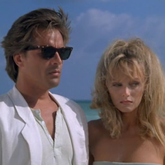
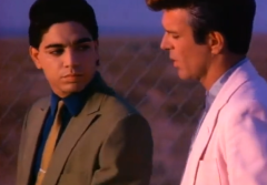
Just to say, that your aspect ratio is off there. Miami Vice is vintage television, square 4:3 ratio. You can see Don is distorted in the image above to fit your rectangular screen. Check your aspect ratio on your screen, it should be set to 16:9. And check your player is set to output discs at their original resolution; all the Miami Vice Blu-rays are 16:9 with black bars either side and the 4:3 image in the middle. So you want black bars either side, full picture visible and no distortion; horizontal stretch; cropped, losing top and bottom of image; vertical stretch; 4:3 with 4:3 bars imposed by screen (Blu-rays have these black pillarbox bars already); 4:3 squashed and stretched to cinema ratio; 4:3 zoomed to cinema ratio, but with imposed unnecessary black top and bottom that wastes screen space; correct 4:3 in a 16:9 frame, every pixel of the screen is used to display every pixel of the disc; in addition to all of that, make sure your screen overscan setting is off, or you will lose a tiny bit of the image. And make sure you use a screen setting like Cinema or True Cinema, not Normal, Dynamic, Game or anything. You want to see the disc as it is, not have the screen make any choices. Also noise reduction settings should be disabled and any sharpness sliders should be set to middle if that is off - or down to nothing if that takes it off. You want the original film grain that the high definition scan has captured to render the detail of the film. You don't want more or less than intended - no screen can create detail that isn't actually there on the disc when viewed unaltered. Anything that claims to is a trick, don't be fooled. However, if you the user decide you actively want any of these settings to differ from correct presentation, that is of course up to you. I'm just pointing out what's intended by the makers of the show Equally here, up to you. But this has been a thing that has caused quite a bit of controversy in recent times - the difference between film and video. Film is 24 frames per second, so Miami Vice should be coming through at 24p and 1080 resolution. You can mess with that with your Live mode and it will seem, as you say, to not be like film... that's what it's for. Once again, up to you. But Miami Vice is film. A change just for seeing what it's like is fine, but these guys have a good point as to why it shouldn't be like that, from the point of view of film as film; But as they say, it's all about enjoyment, so whatever floats your boat. So long as it's a conscious choice, rather than your player and screen settings not being set up by the person watching1 point
-
I'm checking shades of colors out right now. Apparently, purple is wider than I'd ever imagine. I am a little lost here, because according to this link purple includes purple itself and magenta, but it gets confusing because magenta is also a shade of pink (this link)! After checking again images from NBC's 110 plus USA's TMTL (1990, cable), I'd say blue logos (top) are a lot more common than green (except on Season 2), and pink logos (bottom) are immensely more common than purple. I believe @Ferrariman is correct, that is exactly it. I could find only one season that'd have them both together, on the same ep logo, and that is Season 3! I can see 4 episodes that have green and purple together on S3, they are Killshot, Walk-alone, Shadow in the Dark and El Viejo. El Viejo is number one (they all are very close on pink, but when it comes to green EV is the best). I don't seem to find this combination elsewhere. One place on the org in which all members can check them all for themselves is from here on. Anyway, no matter what color name is in use, the DVDs and the Blu-Rays are far from the original look. As we all know, there are many shades of a color, so even when NBC and Mill Creek (for instance) do match in color name, shades comparison show Miami Vice in digital is a joke. It seems that's only about the logos, but that is not the case, the logos deviations tend to show (in a more obvious way) what is happening during the whole ep. It's even hard to get a white wall that has not become somewhat reddish on the DVDs/HDs. I'll post below the 4 eps on NBC and Mill Creek. Keep in mind that differences are even worse regarding other eps from Seasons 3-5 (no purple originally). Killshot Walk-Alone Shadow in the Dark El Viejo I can see it all better if I save the images on my computer and open then fullscreen. There's an additional issue here. You all might notice that on the NBCs, the "I" of Vice show two different shades. That's an analog issue called "color bleeding" very common on VHS. If I did my homework right, we should consider the portion on the right side of the "I". @ViceFanMan, to my eyes, after checking purple shades, I'd now say those four eps would qualify as green-purple, and I am sure I must have said something different than that previously. But I believe images above show just the same that the BDs logos have nothing to do with NBC's logo patterns anyway.
_source1_a1.thumb.jpg.04b0113adb27f4bcb86ec97760020803.jpg)
_04_32.thumb.jpg.05dffc2624ff1c79b03ff88c16f83446.jpg)
a1.thumb.jpg.6c63c815cd73c12f7be32c4d47a29cf9.jpg)
_04_40.thumb.jpg.92f372d5e644ebc12d6abe86a2c1e6a9.jpg)
a1.thumb.jpg.b9a72c22dcbdb2ce3ca71211544ae46e.jpg)
_03_42.thumb.jpg.c2444dadfa73bdbc895d906e8868ed2f.jpg)
a1.thumb.jpg.566fdb9e45393a6cb2f8bb28906ca78e.jpg)
_03_42.thumb.jpg.4b78762a291b6d2b214eeef650c10489.jpg) 1 point
1 point -
Back in the day when I would record Vice I would actually cut the commercials while I watched the show. It was easy because every single break had exactly 4 commercials! I've told this story numerous times but it's worth repeating. Dadrian will remember it. You could never get me out of the house on Friday nights but in 1984 my 30th birthday fell on December 7th, a Friday night. My wife had planned a surprise party for me but I refused to leave the house. She eventually had to ruin the surprise to get me to go. The episode was "Give A Little, Take A Little" and it remains the only episode I recorded that has commercials in it!1 point
-
To be honest, part of me wonders whether the original uncut footage you're talking about (stuff like the longer love-making scene in "By Hooker, by Crook") even exists any more. Back when Vice was made, there was no incentive for the studio to keep deleted stuff because home video didn't really exist, let alone DVD or Blu-ray with hours of storage space for extras. The only time people ever saw shows again was in reruns, for which these cuts were made. I wouldn't be surprised if the stuff they removed got binned when they made the alterations. Yes, it would be fantastic if Universal could locate the original masters, reinstate anything cut since the original broadcast, clean them up, properly colour-grade them so they actually match the original image and maybe even add whatever other footage they can find as deleted scenes, but all that is terribly expensive and time-consuming. The profit just isn't in it for them. Frankly I'm just glad they went to the trouble of paying for the music rights, because I know that was a big hurdle in getting the show to DVD. That one's rather obvious - they were changed to make it clear they were two-part stories, so you didn't get people tuning in to "Golden Triangle" part 2 and wondering what the hell was going on.1 point
-
Betamax would be a treasure for a millennial like me who never experienced the original airing. I'd probably prefer that every once in a while and on a CRT screen for nostialgic aesthetic reasons. But Bluray is great for the cinematic experience.1 point
-
If what you are after is maximum picture area, that's not the Koch versions as they have cropped the sides in. Mill Creek and Elephant are matted the same if you take that previous comparison and open this one in a new tab you can see. Generally 4:3 varies massively in this repsect. And Koch have matted harder for a more accurate 4:3 ratio, even though that means a trim on the sides and showing less picture. But as we see with feature films, many are not interested in if it's the correct ratio, they just want maximum picture. Which is not really appropriate, artistically, as the full exposed frame has rounded corners and the director of photography only frames for the action in the intended shot, not to have microphones or edges of sets visible which is what happens if you watch the full original uncropped frame of most things. When Vice was broadcast, people were watching on CRT screens which have a large overscan border around the edge - many modern screens have an option to turn overscan on or off and that tends to crop out any unwanted edge and the amount is the kind of difference we are seeing here with Vice. Of course overscan on a widescreen TV will not help with the sides of the 4:3 frame here, only top and bottom, as the black pillarbox is actually part of the Blu-ray image; it's a widescreen picture really, just with a 4:3 square set in the middle of it. And so those edges are set when the disc is prepred, not by the consumer, who can only make a difference to the top and bottom of frame by using overscan. But we're fans and these differences matter to fans. I for one have more than one copy of Vice, because I'm a fan and a collector and differences interest me. But for most, seeing and hearing the action is what matters, not how wide or narrow the 4:3 is1 point
-
Yes, If that’s what I’m thinking I have opened the thread and uploaded hundreds of images on those discussions. I’ve touched the subject here in order to see if there were any improvements with the Koch release. Even if the matrices were (they are) the same, they could have been partially corrected digitally, the same way someone can correct degraded Polaroid images on Adobe Photoshop or old 8mm family film reels on Adobe Premiere (with LUTs and things like that).1 point
-
maybe not in your living room but makemlv can do the trick. you'll just have to decompress and rebuild the first time you watch your episode. and have a at least a 750 Go DD dedicated for that purpose only. but yesterday i made the test, and it works great. an episode with only one audio track, and no subtitles weights ~ 5.6 Go. you'll need of course a BR reader for PC, but you can have second hand ones for very cheap. got mine (a good LG) for less than 30€. also keep in mind makemkv is free for 30 days. after that you'll have to take out 60$. so you need to do the stuff in less than one month. but it can easily be done, as with a 7700, i decompressed an episode in less than 10 min. and the image is great. the same as a living room reader one. in case you wondered makemkv is very easy to use. you launch the soft, you show it the reader. let it read. then tick/untick what you wanna save you can then watch on your PC with any player, or even on your TV, if you have a Steam link, or similar1 point


_source1_a1.jpg.2c7b4ebff0bf3cede23a7058a220f3d8.jpg)
_04_32.jpg.88aa1c695cb0088cd6e07c65c3704964.jpg)
a1.jpg.6ed60d29cad54e1c2ef29d320b200294.jpg)
_04_40.jpg.1fa03987c0d17c8269e6c9b5b291017f.jpg)
a1.jpg.b075ce7c1123ea0bc8e4ec48f352905a.jpg)
_03_42.jpg.ad4da2c63b7de4d18f58247616e2b290.jpg)
a1.jpg.43327b28c2c772c355e87427ccc70a02.jpg)
_03_42.jpg.6e397d30ba354be92e728457c3e05009.jpg)