ArtieRollins Posted January 27, 2017 Report Share Posted January 27, 2017 (edited) Earlier this week I was walking into one of the very few and rare music/movie shops left in my town and I suddenly came over one of my all time favorites, Groundhog Day (1993) and they had three different copies in the store. 1 DVD and two Blu-rays (I do have 4-5 version of the film in my collection, but as a huge movie lover/collector, I often end up double-dipping or even tripple-dipping whenever I find a new version of a favorite, or if it comes packing with some brand new features). Anyway, I already knew that the artwork on the 15th anniversary edition some time ago were shockingly bad, but now an even newer Blu-ray edition had been released, which looked like it was done on photoshop within 2 or 3 minutes. I know, the original movie poster of Groundhog Day was certainly no masterpiece, but can't they afford hiring someone who at least show a little effort when doing these absolute horrible updated DVD/Blu-ray artworks: Look at this monstrosity. I know that many of us Groundhog fans hoped to see Bill Murray doing some new feauteres like maybe a couple of interviews but nothing, and who knows, maybe he did fire up some of the producers, and in return someone decided to "hit back" with this horror show, celebrating the film in 2008. His face looks like it is about to melt and are truly the stuff of nightmares. The newer one is not exactly much better, with using the original artwork but in the end gives it a very dull and lifeless approach. I know that most people probably don't give a damn, but as a lifelong fan of movie posters/VHS covers, it really is as shame to see how poorly most of the classic films are being treated when they are being re-released on DVD/Blu-ray. What are your picks for "favorite" great movies with horrible artwork? Edited January 27, 2017 by ArtieRollins 3 Quote Link to comment Share on other sites More sharing options...
ArtieRollins Posted January 27, 2017 Author Report Share Posted January 27, 2017 The first three Vacation films had some real great movie posters that captured the Griswalds whole crazy, adventure and wild ride throughout America, europe and even during Christmas time, and fitted the comedy perfectly and I am glad they decided to stay true to the original artwork when the films were released on DVD. But when these comedy-classics were given a brand new Blu-ray release, they must have hired the cheapest guy around, because this is what the fans ended up with: Quote Link to comment Share on other sites More sharing options...
ArtieRollins Posted January 27, 2017 Author Report Share Posted January 27, 2017 More "worthy" contenders: Heat, fantastic film, not so fantastic artwork. The artwork along with Bobby D looking a lot like Joe Mantegna on the cover, and the tagline which sounds like some awful, DTV, Van Damme/Seagal flick or just another mediocre Liam Neeson effort, make the film seem like just another ordinary brain-dead action fest and not one of the finest action-thrillers of the 90s. Near Dark, one of the best and most original horror movies of the late 80s, surely deserve a hell of much better than this shameful attempt on cashing in on the terrible crap that is the Twilight movies: Quote Link to comment Share on other sites More sharing options...
ArtieRollins Posted January 27, 2017 Author Report Share Posted January 27, 2017 (edited) If it ain't broke, don't fix it. The Terminator is one of those classics that I still to this day have not yet come over a half-decent DVD/Blu-ray release with an ok looking artwork/cover. Why all the sudden changes,? The original movie poster/VHS cover was epic and probably the most badass Arnold ever have looked. Every now and then a "new" special, limited, extended, anniversary, definitive and so on, edition pops out, with one looking worse than another. It is almost fascinating how badly done they are, and that someone actually gets paid in the end of the day and goes along thinking: "Yeah, this looks ok". It's like they don't even try anymore, well at least the earliest releases back in 2001 tried a little, to look like the 1984 poster/VHS copy, but then somehwere along the way, they just gave up: Edited January 27, 2017 by ArtieRollins 1 Quote Link to comment Share on other sites More sharing options...
Vincent Hanna Posted January 27, 2017 Report Share Posted January 27, 2017 Love Thief but not a fan of this artwork, It doesn't look as bad as I remembered it though. Why can't this be the bluray cover or atleast a double sided cover? One of my favourite posters of all time. -- This made me laugh^ Don't know why they changed the name in the UK, violent streets is the most generic title ever. 1 Quote Link to comment Share on other sites More sharing options...
ArtieRollins Posted January 27, 2017 Author Report Share Posted January 27, 2017 Cheat him, and he'll blow you away! Thanks, that alone made me laugh. I agree, Thief has one of the coolest looking posters of all time, and still there are those who tries to "make it better", but instead fails miserably, still the one above Violent Streets are so bad it becomes funny. Poor, Caan he looks so out of place there. Quote Link to comment Share on other sites More sharing options...
Vincent Hanna Posted January 27, 2017 Report Share Posted January 27, 2017 I like how on the bluray release of classic movies they sometimes have the double sided art covers where there's modern style art cover on the front and the original movie poster on the inside. They did that with "Touch of Evil" and "The Killing" , I kinda prefer the new one. e.g. 2 Quote Link to comment Share on other sites More sharing options...
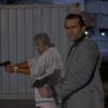
ArtieRollins Posted January 27, 2017 Author Report Share Posted January 27, 2017 (edited) Not even Princess Leia's (Carrie Fisher) beauty could save these hideously poor DVD covers. Edited January 27, 2017 by ArtieRollins Quote Link to comment Share on other sites More sharing options...
Vincent Hanna Posted January 27, 2017 Report Share Posted January 27, 2017 Quote Link to comment Share on other sites More sharing options...
ArtieRollins Posted January 28, 2017 Author Report Share Posted January 28, 2017 Another Michael Mann classic, another victim done wrong by cheap and terrible DVD/Blu-ray artwork. The one from the 2007 Lecter collection is the absolute worst. Since most people seem to only know the Lecter movies through Anthony Hopkins, somebody thought that mixing the god awful Hannibal (2001) movie poster with its red eyes along with a little reference to Buffalo Bill, was a clever idea. In the end, they just don't come any worse than this. From the look of it, those that have not seen Manhunter will think it is just another Hannibal Lecter movie dominated by Hopkins, only to find out later on that Lecter (Brian Cox) is not the main star, but have a very little but important part. Hopefully some of them will enoy it, or even love it, but going in with only having seen the cover, there is a big chance of being disappointed. Halloween 3: Season of the Witch (1982) Ok, not a great movie, but I am one of those few that really like it for what is and isn't. No it does not feature Michael Myers and as originally planned by John Carpenter, he wanted to kill of Myers in the second one, for good. So they tried something new, sadly it backfired. Fans hated it, (because it did not have their beloved villian) and therefore, it has since been branded "worst movie ever". Over the years several VHS and DVD releases continue to piss on the film and confuse the buyers, as for those thinking it will be another 90 minutes of seeing some maniac in mask, killing off horny teenagers, (after buying this scandinavian 2001 DVD), they will be in for a big surprise. For me, it was one the best surprises ever, as I loved the suspense and chilling atmosphere, plus Conal Cochran was a far more evil and sadistic cold hearted bastard than Michael Myers, as he wanted to kill as many kids around the world as possible, and in a truly horrible way, and not just become some party pooper, who goes screwing up some horny teenagers home parties with a knife and mask every Halloween night. Die Hard 1-4 I really do hate the 4th and 5th film, but one thing they all got in common are these dull and very cheap looking covers. But who knows, somebody might have went all the way with their creativity skills one these ones. It actually looks like the helicopters are attacking the Nakatomi plaza, especially the one above (in Godzilla style) with what looks like a huge fireburst, and instead of trying to rescue the hostages they seem to barbeque the whole building. I decided to leave the fifth one out, as imagination might do it better justice than it deserves, as it is actually too hard trying to find a "decent" looking cover. 1 Quote Link to comment Share on other sites More sharing options...
AzVice Posted January 28, 2017 Report Share Posted January 28, 2017 yeah i don't get why they dump the original poster artwork for some of these new pictures. and they do it on most every dvd. did it on the Bond dvd's, did it on Star Wars. strange Quote Link to comment Share on other sites More sharing options...
ArtieRollins Posted January 29, 2017 Author Report Share Posted January 29, 2017 (edited) I hope that the "excuse" as to why we far too often end up with so many terrible artworks is caused by some copyright issues, but I guess it is more likely due to the fact that most people these days don't go out and buy physical formats like VHS, DVDs, Blu-rays etc anymore. Who needs a great looking piece of movie artwork in your collection when one can only download or stream the whole thing for free onto some computer/mobile phone, and then watch it once, and never again. Edited January 29, 2017 by ArtieRollins Quote Link to comment Share on other sites More sharing options...
ArtieRollins Posted January 29, 2017 Author Report Share Posted January 29, 2017 (edited) Some of these artworks are so hideous that it is almost fascinatingly bad, but at the same time its impossible to look away. People actually got paid for doing these, which makes it even funnier than it probably should be. Either that or who knows, maybe it is the same guy who keeps on destroying all the great artworks and replacing them with horrible ones, day after day. Anyway, he really must love his job. Some of these belong in a freakshow or museum of "special" art, and not in peoples film collections. Did they really think that giving them new and "cool" names such as Flashback edition, knockdown edition and more, would cover up how badly the rest of the artwork is? And the winner? Well, I guess I could manage to give this one a bit of a competition if I had a couple of minutes to go with and thanks to the magic of Paint, but still, this one is really as cheap as they come. Edited January 29, 2017 by ArtieRollins Quote Link to comment Share on other sites More sharing options...
agent 47 Posted January 31, 2017 Report Share Posted January 31, 2017 That Manhunter one is particularly atrocious and looks like one of those cheap dollar-bin Horror anthologies put out by Echo Bridge. The movies that come to mind the most when it comes to bad covers are the Bond movies on Blu-ray. http://www.blu-ray.com/movies/Thunderball-Blu-ray/53928/ The Thunderball one from 2012, not bad in theory but the way they digitally processed Connery's face makes him look like he went for an Adam Lambert-style eye shadow routine before going on his mission. http://www.blu-ray.com/movies/Live-and-Let-Die-Blu-ray/136371/ Bond looks like an unfinished wax figure of Elvis Presley http://www.blu-ray.com/movies/The-Man-with-the-Golden-Gun-Blu-ray/53930/ Note what's wrong? A helicopter in the top corner. One of the only Bond movies that didn't even have a helicopter in the film. http://www.blu-ray.com/movies/For-Your-Eyes-Only-Blu-ray/53935/ The helicopter blades look as if they are about to cut into Bond's legs. http://www.blu-ray.com/movies/Licence-to-Kill-Blu-ray/53932/ Remember when Timothy Dalton's Bond played a high-stakes card game during a storm of listerine? No? Well that's kind of the plot this cover evokes. http://www.blu-ray.com/movies/The-World-is-Not-Enough-Blu-ray/53927/ This one is just sad and generic. 2 Quote Link to comment Share on other sites More sharing options...
ArtieRollins Posted February 1, 2017 Author Report Share Posted February 1, 2017 15 hours ago, agent 47 said: The movies that come to mind the most when it comes to bad covers are the Bond movies on Blu-ray. How the hell could they go on from the original, beautiful and adventurous classic movie posters of the 60s, 70s even 80s to such trash, is just beyond amazing. Every now and then the Bond films comes out with a new package (the same material on the inside though), and they keep on making it look more hideous, every single time. I remember thinking the 2004-05 DVDs were awful, but these new Blu-ray edition, really set a new standard for cheap and generic looking DVD/Blu-ray artwork. Quote Link to comment Share on other sites More sharing options...
Detective_Crockett Posted February 1, 2017 Report Share Posted February 1, 2017 (edited) Here's a good comparison between the original great art, and the horrible Blu Ray art. Edited February 1, 2017 by Detective_Crockett Image appearing twice. 1 Quote Link to comment Share on other sites More sharing options...
ArtieRollins Posted February 13, 2017 Author Report Share Posted February 13, 2017 Hoffman's cracked glasses pretty much sums up the horror he must have felt of seeing himself on that terrible Blu-ray cover. Not a great movie by any means, but still very entertaining though. Beautiful babes with big guns and little or no clothes, fighting each other for the last man standing in a Mad Max post-acpolayptic "future" that could just as easily be taken for a sex dream, and is so silly and stupid that it actually becomes a hilarious and very watchable b-movie. Anyway, a couple of years ago Echo Bridge (I think) gave it a DVD release and since the film has 2-3 different titles, they went for the most cheesy and funny one, She-Wolves of the Wasteland (1988). Ok, the original movie poster of (Phoenix the Warrior) ain't no piece of art, that's for sure but still, to manage to go from the not so great looking original, and end up with the gruesome DVD cover of the 2007 release, that is is quite an achievement, and surelely stands as one of the nastiest and most cheap looking, "re-releases" ever to be put out. So they got the title right, or not but still I like the change from Phoenix the Warrior to, She-Wolves but that is all. You have three horrible photo-shopped women, (one of them has just 1 arm, and the big blonde (kind of look like Kim Basinger) in the middle has a hand that looks like it is either melting, or is it some kind of a horrible growth or Alien monster sticking his head out of her stomach, anyay the last one actually looks pretty normal though). Quote Link to comment Share on other sites More sharing options...
Detective_Crockett Posted July 13, 2017 Report Share Posted July 13, 2017 Guardians of the Galaxy 2's cover looks like it's going to be awful.. just look at this I much prefer the black and white version of this cover they released, it was a nice little nod to the Ramones, in colour it just spoils it. Quote Link to comment Share on other sites More sharing options...
Recommended Posts
Join the conversation
You can post now and register later. If you have an account, sign in now to post with your account.