ivoryjones Posted December 27, 2015 Author Report Share Posted December 27, 2015 Season Four069-Contempt of Court (NBC) (DVD) 070-Amen... Send Money (NBC) (DVD) 071-Death and the Lady (NBC: Rerun on January 29, 1988) (DVD) 072-The Big Thaw (NBC) (DVD) 073-Child’s Play (NBC) (DVD) 074-God’s Work (NBC) (DVD) 075-Missing Hours (NBC) (DVD) 076-Like a Hurricane (NBC) (DVD) 077-The Rising Sun of Death (NBC) (DVD) 078-Love at First Sight (NBC) (DVD) 079-Rock and a Hard Place (NBC) (DVD) 080-The Cows of October (NBC) (DVD) 081-Vote of Confidence (NBC) (DVD) 082-Baseballs of Death (NBC) (DVD) 083-Indian Wars (NBC) (DVD) 084-Honor among Thieves? (NBC) (DVD) 085-Hell Hath no Fury (NBC) (DVD) 086-Badge of Dishonor (NBC) (DVD) 087-Blood & Roses (NBC) (DVD) 088-A Bullet for Crockett (NBC) (DVD) 089-Deliver Us from Evil (NBC) (DVD) 090-Mirror Image (NBC) (DVD) 1 Quote Link to comment Share on other sites More sharing options...
ivoryjones Posted December 27, 2015 Author Report Share Posted December 27, 2015 Season Five091-Hostile Takeover (NBC) (DVD) 092-Redemption in Blood (NBC) (DVD) 093-Heart of Night (NBC) (DVD) 094-Bad Timing (NBC) (DVD) 095-Borrasca (NBC) (DVD) 096-Line of Fire (NBC) (DVD) 097-Asian Cut (NBC) (DVD) 098-Hard Knocks (NBC) (DVD) 099-Fruit of The Poison Tree (NBC) (DVD) 100-To Have and to Hold (NBC) (DVD) 101-Miami Squeeze (NBC) (DVD) 102-Jack of All Trades (NBC) (DVD) 103-The Cell Within (NBC) (DVD) 104-The Lost Madonna (NBC) (DVD) 105-Over The Line (NBC) (DVD) 106-Victims of Circumstance (NBC) (DVD) 107-Freefall (NBC) (DVD) 108-World of Trouble (NBC) (DVD) 109-Miracle Man (NBC) (DVD) 110-Leap of Faith (NBC) (DVD) 111-Too Much, Too Late (USA Network: most probably first run on January 25, 1990, as on the episode end credits the USA network announcer mentions Jemal Hinton fight “tonight†at 9 p.m. live on USA “Thursday Night Fightsâ€, and Hinton indeed fought Hector Diaz on January 25, 1990, a Thursday...) (DVD) 1 Quote Link to comment Share on other sites More sharing options...
DJAngel Posted December 27, 2015 Report Share Posted December 27, 2015 I saw the change in the original series on TV in the 80's. They changed the colors on the original series, when it was show then Quote Link to comment Share on other sites More sharing options...
Matt5 Posted December 28, 2015 Report Share Posted December 28, 2015 Great post and detail !! Quote Link to comment Share on other sites More sharing options...
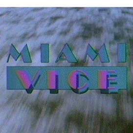
ivoryjones Posted October 18, 2016 Author Report Share Posted October 18, 2016 (edited) In these days of new digital releases of Miami Vice, and now that we know that the Blu-Rays won't change that much the state of things when it comes to colors (Mill Creek already confirmed as such, Fabulous Films probably the same master), I worked on some other comparisons, away from the logos (focusing on episode scenes). Below, an NBC image will come first, then there'll be its Universal DVD counterpart right after. Wherever there's more inventive lighting, the digital sources seem to me worse (so you'll notice that things get somewhat more dramatic after Season 2). But there are a few exceptions as you may see ("Rock and Hard Place" is not bad on DVD IMO) Pilot Evan Lombard Out Where The Buses Don't Run When Irish Eyes Are Crying Duty and Honor Child's Play The Rising Sun Of Death Rock And A Hard Place ] Indian Wars Badge of Dishonor Asian Cut Edited October 18, 2016 by ivoryjones 1 Quote Link to comment Share on other sites More sharing options...
Tony D. Posted October 18, 2016 Report Share Posted October 18, 2016 The big difference is more important in the sharpness of the images. Although the original had more color, the faces were a lot more fuzzy than in the DVDs. Thanks, Ivoryjones! 1 Quote Link to comment Share on other sites More sharing options...
Matt5 Posted October 18, 2016 Report Share Posted October 18, 2016 9 hours ago, Tony D. said: The big difference is more important in the sharpness of the images. Although the original had more color, the faces were a lot more fuzzy than in the DVDs. Thanks, Ivoryjones! A shame the new blu ray release looks like it doesn't feature the original colors either ! Quote Link to comment Share on other sites More sharing options...
Administrators James Posted October 19, 2016 Administrators Report Share Posted October 19, 2016 You have to keep in mind the fact that analogue TV naturally had enhanced colours back in the 70s and 80s, and everything looks more on the blue side of the spectrum on the TV broadcasts. Could it be possible that the digital releases are the natural film colours while the TV version was the altered one? 2 Quote Link to comment Share on other sites More sharing options...
Tony D. Posted October 19, 2016 Report Share Posted October 19, 2016 9 hours ago, James said: You have to keep in mind the fact that analogue TV naturally had enhanced colours back in the 70s and 80s, and everything looks more on the blue side of the spectrum on the TV broadcasts. Could it be possible that the digital releases are the natural film colours while the TV version was the altered one? That is possibly true. We like the enhanced colors more than the real ones. Quote Link to comment Share on other sites More sharing options...
Matt5 Posted October 19, 2016 Report Share Posted October 19, 2016 On 10/18/2016 at 0:51 PM, ivoryjones said: In these days of new digital releases of Miami Vice, and now that we know that the Blu-Rays won't change that much the state of things when it comes to colors (Mill Creek already confirmed as such, Fabulous Films probably the same master), I worked on some other comparisons, away from the logos (focusing on episode scenes). Below, an NBC image will come first, then there'll be its Universal DVD counterpart right after. Wherever there's more inventive lighting, the digital sources seem to me worse (so you'll notice that things get somewhat more dramatic after Season 2). But there are a few exceptions as you may see ("Rock and Hard Place" is not bad on DVD IMO) Pilot Evan Lombard Out Where The Buses Don't Run When Irish Eyes Are Crying Duty and Honor Child's Play The Rising Sun Of Death Rock And A Hard Place ] Indian Wars Badge of Dishonor Asian Cut Great pics ! Thanks for posting! 1 Quote Link to comment Share on other sites More sharing options...
Administrators James Posted October 20, 2016 Administrators Report Share Posted October 20, 2016 15 hours ago, Tony D. said: That is possibly true. We like the enhanced colors more than the real ones. Yeah... Look at this screenshot for example: ^ The ship in the background is white. However on the TV broadcast, it looks like there's a blue filter over it. I decided to have a crack at colour correcting, so I opened up Sony Movie Studio and this is the best I could make it without compromising the rest of the episode. But it's hard to find the sweet spot so that the rest of the episode doesn't look weird. I couldn't find the exact spot, probably due to film fading over the years so the colours will never be the same. If I add that much blue over that frame to match the TV broadcast, the rest of the episode looks like a blue world. 1 Quote Link to comment Share on other sites More sharing options...
ivoryjones Posted October 20, 2016 Author Report Share Posted October 20, 2016 (edited) 5 hours ago, James said: I couldn't find the exact spot, probably due to film fading over the years so the colours will never be the same. If I add that much blue over that frame to match the TV broadcast, the rest of the episode looks like a blue world. I liked your image improvements. I'd be delighted to play one of the discs and get that boat image you showed. It's funny to see that as the white boat got some blue filter, also the "Edward James Olmos" text turned to be more white again, and the sky more natural. From time to time, I try to get somewhere with Photoshop. I don't think I've got as far as you did. To me it's always like this: you correct one color, you screw the other. On the openings, whenever I get rid of the "mud sea" of the DVDs and the "snooker green" of MIAMI logo, the "purple" of VICE gets even worse (instead of starting to look like a strong pink) and the skins of the actors look wrong. Since some months ago I started trying some white balance adjustments. No luck with that at all... Film fading must be the main reason for this mess. That's why we get pinkish credits, pinkish whites, greens instead of blues (please check Tegoro image from Asian Cut above!!!!). Those flamingos of When Irish Eyes are Crying are an insult: they're dead flamingos, not the alive and kicking ones from NBC. I still don't get how in the world the pink VICE turned to be some sort of purple.. I do think, however, that if the companies cared more about it, and didn't regard it possibly as "just an '80s show with funny hairstyle" they would reach results that we can't when we take their lousy discs as our working material (on Photoshop or Sony Movie Studio). I think they've killed some tints that we can't recover from their discs. Please check the first Asian Cut image, the guy in it had originally 2 colors in his face, nowadays he lost one of them. So look what I've just found: a pic from the set! Notice that the guy had the two colors in this face! Also, maybe they could do something that we can't when they had the prints on their hands... They must have a know-how about this kind of issue, otherwise prints way older than Vice, like "Gone With The Wind", "2001", wouldn't look as nice as they do in digital. Even MM's Manhunter and Thief look terrific (terrific blues everywhere!). Maybe they can use software but also can restore "physically" the print (but didn't)? I wouldn't also rule out another hypothesis: they screwed the colors thinking that the original ones were "wrong". Maybe they thought things like "there's too much blue all over it". Maybe they thought that the Miami Vice logo on Seasons 3-5 should be corrected in order to look more or less like the Miami Vice logo on Seasons 1-2 (then, on Seasons 1-2, green MIAMI was more common). Who knows. It's fact that Miami Vice had originally some unrealistic look sometimes, to me it was always part of the magic (a deep blue sea, exploding neons). Maybe some "genius" team in the mid 2000s thought it was print aging and it should be corrected. Actually that would have to be mid '90s, as the Columbia House tapes were already half-way bad... Edited October 20, 2016 by ivoryjones Quote Link to comment Share on other sites More sharing options...
Administrators James Posted October 20, 2016 Administrators Report Share Posted October 20, 2016 1 hour ago, ivoryjones said: Film fading must be the main reason for this mess. That's why we get pinkish credits, pinkish whites, greens instead of blues (please check Tegoro image from Asian Cut above!!!!). Those flamingos of When Irish Eyes are Crying are an insult: they're dead flamingos, not the alive and kicking ones from NBC. I still don't get how in the world the pink VICE turned to be some sort of purple.. Yup, and watching the surveillance scene in The HIt List, it's like the pink colour just faded out of the shirt completely if you compare it to the original broadcast. 1 hour ago, ivoryjones said: I do think, however, that if the companies cared more about it, and didn't regard it possibly as "just an '80s show with funny hairstyle" they would reach results that we can't when we take their lousy discs as our working material (on Photoshop or Sony Movie Studio). I think they've killed some tints that we can't recover from their discs. Please check the first Asian Cut image, the guy in it had originally 2 colors in his face, nowadays he lost one of them. So look what I've just found: a pic from the set! Notice that the guy had the two colors in this face! 1 hour ago, ivoryjones said: Also, maybe they could do something that we can't when they had the prints on their hands... They must have a know-how about this kind of issue, otherwise prints way older than Vice, like "Gone With The Wind", "2001", wouldn't look as nice as they do in digital. Even MM's Manhunter and Thief look terrific (terrific blues everywhere!). Maybe they can use software but also can restore "physically" the print (but didn't)? They probably don't see a point, or the people in charge just aren't enthusiastic about it... It is odd that Manhunter looks amazing, yet Miami Vice is sketchy. It could be multiple things, different brands of film, different quality, ages differently? Or maybe because Manhunter is just one 2 hour long movie, where as Miami Vice is over 90 hours of footage to go through. Restoring Manhunter wouldn't be as time consuming. Too much work for so little reward. I couldn't restore the colours myself with Sony Movie Studio, I'm sure you'd need something more professional than that. And I'm sure they have the tools and resources available. And they'd probably do it scene-by-scene rather than one colour for all. However... The green dirty water kind if is realistic for that area though... So your theory that they thought the blue looked silly and decided to leave it as a more raw look seems plausible. 1 Quote Link to comment Share on other sites More sharing options...
Vincent Hanna Posted October 20, 2016 Report Share Posted October 20, 2016 I didn't watch the show when it aired but It sounds more like the bluray/dvd's are what the show originally looked when filmed and the distorted colours that you guys love are the product of the old 80s cathode ray tube TVs that make the neon lights washed out..etc I know it sucks when you see something years later and it doesn't live up to the expectations(or just differs) from your childhood experience but just from looking at screenshots of the new bluray's the show looks fantastic. The colour palette that actually was supposed to be there looks amazing. 1 Quote Link to comment Share on other sites More sharing options...
ivoryjones Posted October 20, 2016 Author Report Share Posted October 20, 2016 (edited) James, this image is incredible! So maybe the problem has to do not only with print aging but also with bad restoring choices (one, or the other, or a combination of both). Imagine one trying to make this Manhunter image "real": Or maybe trying to get this "Thief" pic right: Maybe that's what happened here (Duty and Honor is not overall that bad, but the "blue" scenes became a nightmare on DVD - so maybe it's not about print aging only): Trying to make it right??? Of course, digital offers some fantastic moments. I would say that I even prefer the digital look in that Hit List pic you posted than the original one from NBC. I think in that case the "mood" of the image was kept, and the image quality is astonishing. I also think that in "Rock and a Hard Place" (above), the DVDs kept the original "feel" of the old source, but with a clean image. I know many here are also watching the discussion at form.blu-ray.com and forums.stevehoffman.tv. Considering the latter, there's a member there who worked on MV's Seasons 4 and 5 for broadcast and syndication. I get from his comments that he must have worked directly with transfers, from print to the NBC masters (professional tapes). He makes it clear the old Miami Vice look was no "analog" accident, it was well thought and demanded by the production. Maybe this could be part of the problem: Michael Mann supervised and approved "Thief" and "Manhunter" transfers to DVD/Blu-Ray, but as far as I know there's no mention of him being consulted for the Miami Vice DVDs/BDs. Some comments below are to me invaluable. http://forums.stevehoffman.tv/threads/miami-vice-the-complete-series-comes-to-blu-ray-10-4-16.560768/#post-14646958 "the show was fairly heavily supervised by Universal and the staff producers, and they had very specific ideas as to how they wanted things to look. That was both a colorful show (for the bright scenes) and a dark show (for the night scenes), which was very challenging" http://forums.stevehoffman.tv/threads/miami-vice-the-complete-series-comes-to-blu-ray-10-4-16.560768/page-3#post-15212776 " Sometimes in mastering, bad choices get made and crap gets out. I think the transfers for DVD may have been made from 35mm interpositives (IP), which would explain the yellow/brown cast. But I dunno -- I wasn't there, and I don't know who did the work. Getting whites and blacks right is TV 101, and doesn't require any skill; you just have to work hard and get it right.The opening logo should be absolutely white and blue/pink, and to make sure that was consistent when I did the mastering from 1987-1988, we actually held on to some reference stills from the first show of the season and matched it on every subsequent episode. For the last 15 years, main titles have been digital so all this stuff is almost always 100% consistent. You may not like how it looks, but at least it won't change. " http://forums.stevehoffman.tv/threads/miami-vice-the-complete-series-comes-to-blu-ray-10-4-16.560768/page-3#post-15221999 "The right way to remaster an old movie or TV show is to pull up copies of the original transfers and use those as a basis of comparison. At least then, you have a starting point and a sense of how it should look [my comment: from this I infer that when transferring MV to digital, Universal should have at hand copies of the transfers made for NBC in order to have a sense of how the show should look, something I suppose they haven't done]. In general, we get the whites white and the blacks black, then use good judgement on everything else in the middle. The scopes usually (but always) lead us to the truth, but there's always some interpretation and experience to determine how it should look . [my comment: so maybe someone had some real lousy choices for digital transfers] " http://forums.stevehoffman.tv/threads/miami-vice-the-complete-series-comes-to-blu-ray-10-4-16.560768/page-4#post-15223244 (when replying to someone who wondered if it would be right to use advance settings on a tv to adjust the colors to match) "No, you'd screw it up even more. [my comment: so the final product indeed "limits" our scope of correction? I'd think so] My advice: stop obsessing about it and live with the mistake. [my comment: I sincerely believe that's good advice, and I normally do this with other shows, but here I just can't do it, I am completely fascinated and obsessed by the old look]" Edited October 20, 2016 by ivoryjones 2 Quote Link to comment Share on other sites More sharing options...
Tony D. Posted October 20, 2016 Report Share Posted October 20, 2016 @ James........You did a pretty good job of adding more color, but is it worth the time just for one or two screen shots. I still rather see a sharp image on the DVDs, than a blurry one with more blue & pink colors. 1 Quote Link to comment Share on other sites More sharing options...
mvnyc Posted October 20, 2016 Report Share Posted October 20, 2016 (edited) "The right way to remaster an old movie or TV show is to pull up copies of the original transfers and use those as a basis of comparison. At least then, you have a starting point and a sense of how it should look. This is precisely why I said in the other thread to hold on to your VHS tapes for a point of reference. They (Millcreek) probably did not use the master image transfers or set them up using a WFM-601M/1730A. If they had, the Blu-Ray luminance and chrominance values would be a pretty good match to the original source images. Edited October 20, 2016 by mvnyc 3 Quote Link to comment Share on other sites More sharing options...
ivoryjones Posted October 20, 2016 Author Report Share Posted October 20, 2016 5 hours ago, mvnyc said: "The right way to remaster an old movie or TV show is to pull up copies of the original transfers and use those as a basis of comparison. At least then, you have a starting point and a sense of how it should look. This is precisely why I said in the other thread to hold on to your VHS tapes for a point of reference. They (Millcreek) probably did not use the master image transfers or set them up using a WFM-601M/1730A. If they had, the Blu-Ray luminance and chrominance values would be a pretty good match to the original source images. I searched for images of this WFM-601M/1730A just to see the look of a piece possibly involved in this mess. I've never seen anything like this! What kind of work does this equipment do? Does It "adjust" the master image, correcting things that (in our case) shouldn't be corrected? Quote Link to comment Share on other sites More sharing options...
Dadrian Posted October 20, 2016 Report Share Posted October 20, 2016 Looks like something Noogy would fence. 2 Quote Link to comment Share on other sites More sharing options...
Tony D. Posted October 20, 2016 Report Share Posted October 20, 2016 2 hours ago, Dadrian said: Looks like something Noogy would fence. LOL ! 1 Quote Link to comment Share on other sites More sharing options...
mvnyc Posted October 21, 2016 Report Share Posted October 21, 2016 (edited) Back in my TV, days, Tektronix was the "holy grail" of measurement equipment. You're looking at color bars set correctly on a Tektronix 1735, with luminance and chrominance levels set at 100 IRE, and black levels at 7.5 IRE. Every playback tape set up for broadcast usually has color bars and audio tone at time code 59:30 to 59:50 to set up and calibrate a tape correctly for broadcast, followed by slate (Program Title/Episode) and/or black until the program starts at 1:00:00. The Tektronix WFM601A, E, Or M handled the audio phase of this. In the case of the broadcast air and protect copies of each episode, the bars and tone are laid down on tape and set up to this standard, so theoretically, all colors and audio should be correct. For the Blu-Rays, it seems there was no calibration used, like they just threw the tape up and never set it up correctly. Here is another calibration that puts the correct colors in place, by aligning the "dots" in the "starfield". In-Phase stereo audio looks like this (above) Out of phase stereo audio looks like this (above). Sorry for the TV technical lesson, but taking all of this into consideration, if things were set up correctly, there shouldn't have been a problem video and audio-wise on the Blu-Rays. Apparently, they didn't follow the rules... Edited October 21, 2016 by mvnyc 1 Quote Link to comment Share on other sites More sharing options...
ivoryjones Posted October 21, 2016 Author Report Share Posted October 21, 2016 Thank you so much for this, mvnyc! This stuff is so cool, and It's very nice to learn a bit about it. I know this is pro equipment, and I've never put my hands nearby anything like it, but merely as a home equipment consumer I miss things with buttons everywhere and I do somewhat resent the "minimalist" concept in this area. Anyway, your second picture rang a bell. I was sure I've seen it before. Actually we all have seen it before! It's in "Stone's War"! Captain Maynard was that good. When Crockett brings the tape to Maynard, he uses this to tell him it's a copy: From this, I think it's quite acceptable to believe that Captain Maynard would not be impressed at all by the DVDs and the BDs. If Crockett brought him anything like that, Maynard would say: "You bring me the original NBC masters, you get the little rodent back. I'll be in touch. Don't waste my time again." 3 Quote Link to comment Share on other sites More sharing options...
mvnyc Posted October 21, 2016 Report Share Posted October 21, 2016 2 hours ago, ivoryjones said: Thank you so much for this, mvnyc! This stuff is so cool, and It's very nice to learn a bit about it. I know this is pro equipment, and I've never put my hands nearby anything like it, but merely as a home equipment consumer I miss things with buttons everywhere and I do somewhat resent the "minimalist" concept in this area. Anyway, your second picture rang a bell. I was sure I've seen it before. Actually we all have seen it before! It's in "Stone's War"! Captain Maynard was that good. When Crockett brings the tape to Maynard, he uses this to tell him it's a copy: From this, I think it's quite acceptable to believe that Captain Maynard would not be impressed at all by the DVDs and the BDs. If Crockett brought him anything like that, Maynard would say: "You bring me the original NBC masters, you get the little rodent back. I'll be in touch. Don't waste my time again." Thanks Ivory. I've been out of the TV business for some time, so the equipment I'm referencing wouldn't be state-of-the-art today, but you get the idea. That picture is pretty funny in that I doubt Crocket could tell the tape was a copy just by looking at the video set-up reference! 1 Quote Link to comment Share on other sites More sharing options...
vicegirl85 Posted October 21, 2016 Report Share Posted October 21, 2016 As a total non-techie, I am enjoying the technical explanations some of you are able to provide. Thank you! 1 Quote Link to comment Share on other sites More sharing options...
ivoryjones Posted October 23, 2016 Author Report Share Posted October 23, 2016 I guess it's not unfair to say that whoever was in charge of the restore process (DVDs and BDs) could have done a lot better. Just a few days ago, James has shown us some cool results adjusting colors (please see above). I was getting nowhere with white balance in Adobe Photoshop. But maybe, just maybe I've got something. I was trying to make a Blu-Ray of an '80s movie to look like its collector edition Laserdisc (which transfer was supervised and authorized by the director), and this time it worked fine. Then, I've tried to use just the same settings for Miami Vice. I must say that right now it won't work everywhere (every ep, every scene), and in some eps it will make it even worse. But here there are some of the best results I've got so far (first the adjusted version, then the original pics from the DVDs, as I'm still to receive my BDs...): Walk-Alone: The Afternoon Plane: Freefall (to me the best logo result): Duty and Honor: Child's Play: Asian Cut: Well, so maybe it's possible to correct what should be corrected by using software (once only Universal staff could put their hands on the prints). If this is any good, the bad news is that I don't know any TV, or BD/DVD player, or BD/DVD software for computer that will process this changes while playing the discs, and usually whenever you correct one color, you destroy the others... So to me it's obvious whoever was in charge of the digital transfers could have done better. I'm an amateur, maybe I've got at least somewhat closer with some effort... Imagine a team of professionals or a good professional alone getting paid and having the prints, equipment and best software to do it? 1 Quote Link to comment Share on other sites More sharing options...
Recommended Posts
Join the conversation
You can post now and register later. If you have an account, sign in now to post with your account.